Brady UX
client · fintech · 2026Vanta

A credit application people can finish,
that still prints the lender's form.

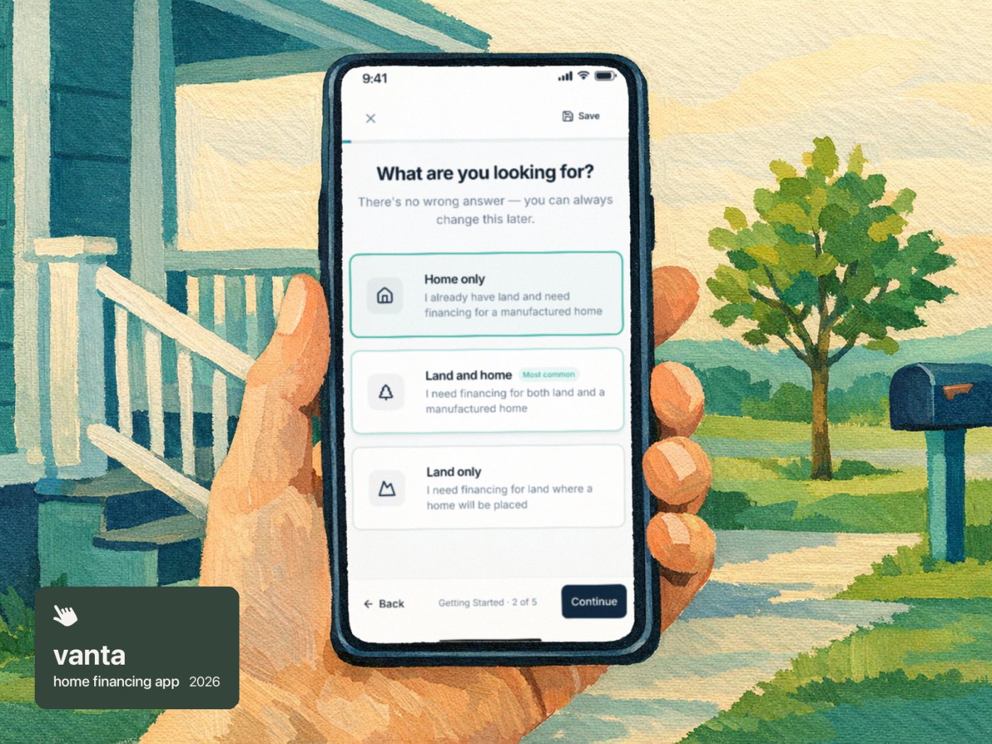
Buying a manufactured home starts with a lender's credit application: five dense pages of boxes and fine print, usually on paper. The lender wasn't going to change its form. So we designed Vanta for two readers at once. The buyer gets a calm, guided conversation on their phone, one topic per screen. The lender gets its own five pages back, filled in exactly, with a signature record attached. And every dealer gets the whole thing in its own brand.

Role
Product design and build, for Bild Media
Built
Spring 2026
Shown with
Sample applicants and a made-up dealer
21short screens for one applicant, 27 when two people apply together
372answers placed on the lender's own five pages
1app that re-skins for every dealer, from one settings screen
48hof no activity before a draft is flagged for a follow-up
The brief

The form couldn't change, so the experience had to

The lender's credit application is five pages long. It asks about the property, the land, every job and paycheck, bank balances, debts, court-ordered payments and more, in tiny boxes with checkbox grids. It's a form built for the lender's underwriters, not for someone sitting in a sales office or on their couch.

We couldn't redesign the form itself: it is the document the lender accepts. What we could design was everything around it. The buyer never sees the paper. The lender never sees anything else.
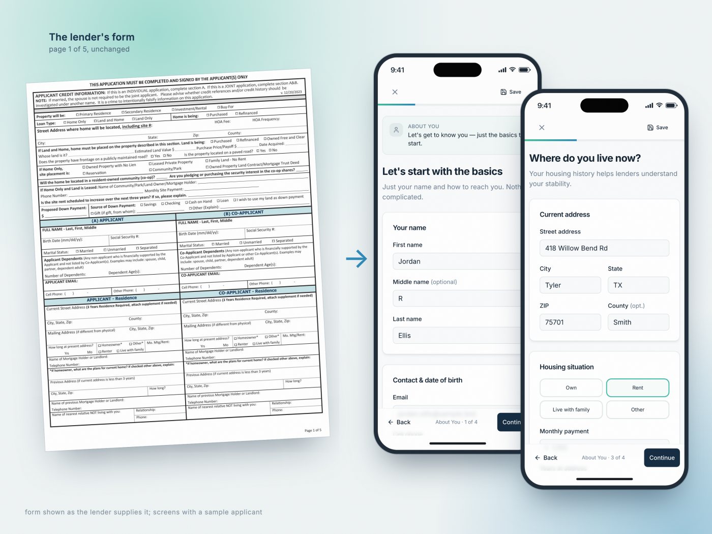
Page 1 of the lender's form, and the same questions as the buyer meets them. Sample applicant.
The conversation

Five pages become five short chapters

The application is split into five sections the buyer can feel moving: Getting Started, About You, Financial Picture, Obligations and Final Details. Each screen asks about one topic, and the footer always says where you are, like "Getting Started · 2 of 5".

The copy does the reassuring. "There's no wrong answer — you can always change this later." "Estimates work fine." "A relative not living with you — for reference only, not a credit check." Questions only appear when they apply: a previous address only if you've lived somewhere less than three years, landlord details only if you rent, a "who is the gift from?" field only if the down payment is a gift.

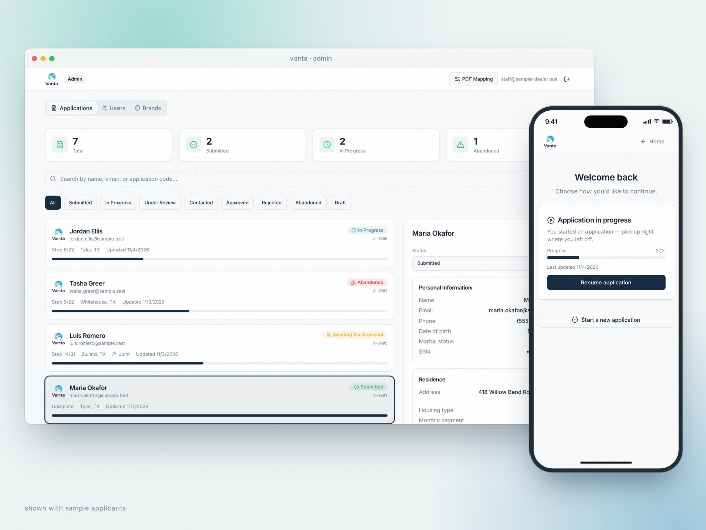
Progress saves as you go, every 30 seconds and on every step, so the buyer can stop and pick up later. Coming back shows "Welcome back" with the draft and how far along it is.

01Getting Startedwhat you're buying, where, the down payment, who's applying
→
02About Youname and contact, household, where you live now, an emergency contact
→
03Financial Pictureyour job, how you're paid, other income, savings
→
04Obligationsdebts not on your credit report, regular expenses
→
05Final Detailsthe sensitive step, a few yes/no questions, review, sign
↺ a joint application adds six screens for the co-applicant, right after About You
The order the buyer meets it.
what would you ship?

Where in the application should we ask for the Social Security number?

By then the buyer has invested in the application and can see the finish. The screen explains why the number is needed and how it's protected before asking for it.

Earning trust

Ask for the Social Security number last

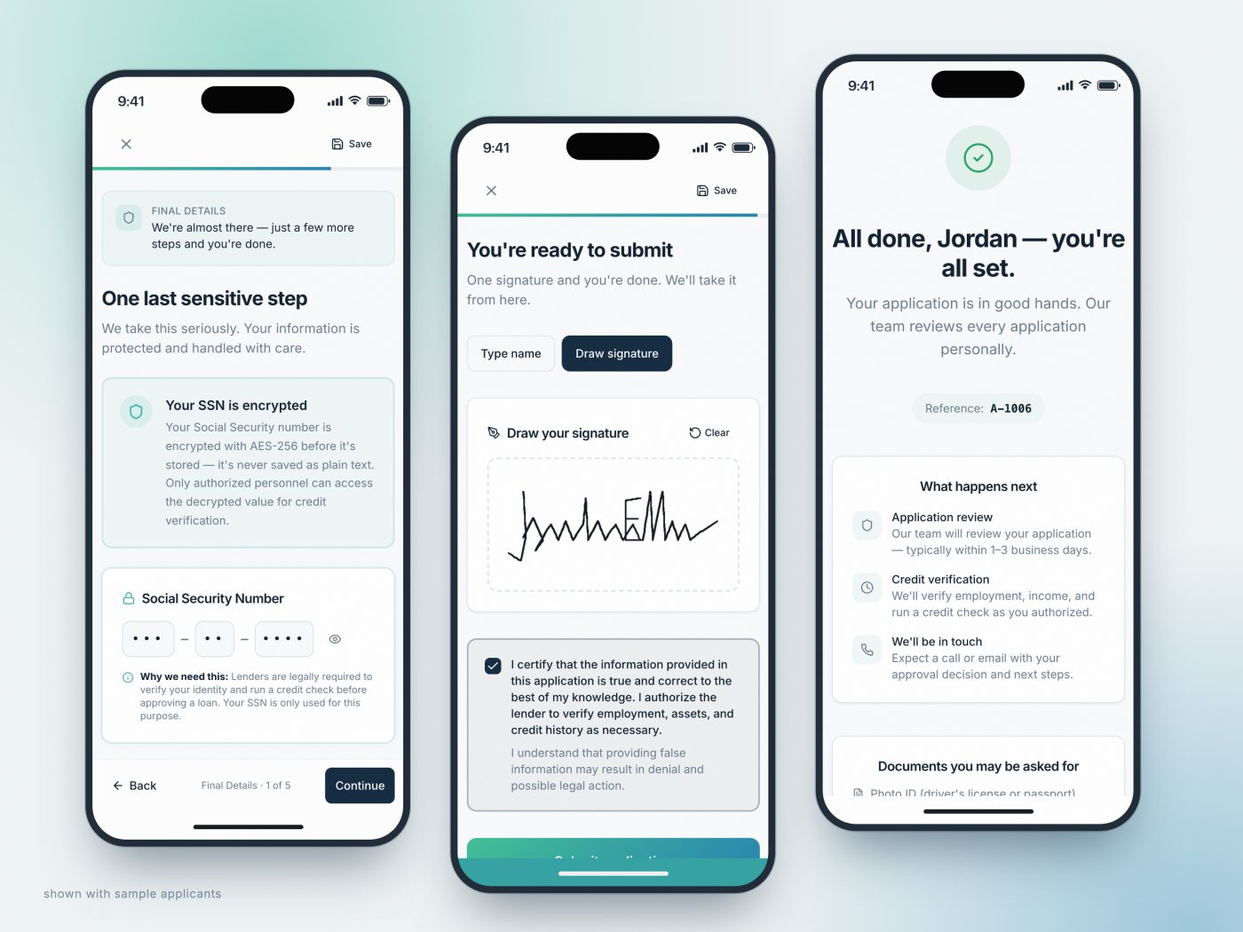
The most sensitive question comes about three-quarters of the way through, after the buyer has already shared everything else and the end is in sight. The section opens with "We're almost there — just a few more steps and you're done." The screen itself is titled "One last sensitive step", explains that the number is encrypted before it's stored, and says why a lender needs it.

The number goes into three masked boxes that jump forward as you type. The government monitoring questions say up front that they're optional and have no effect on approval, with a single "I do not wish to provide this information" box.

Signing is one step: type your legal name or draw a signature, and tick the certification. The submitted file records the signature type, time and certification version on its own audit page.

The sensitive step, signing, and the confirmation. Sample applicant.
what would you ship?

How should hundreds of answers get onto the lender's form?

Lenders revise their forms. With the mapper, a new version means moving chips onto boxes, not a rebuild.

The lender's copy

372 answers, each in the right box

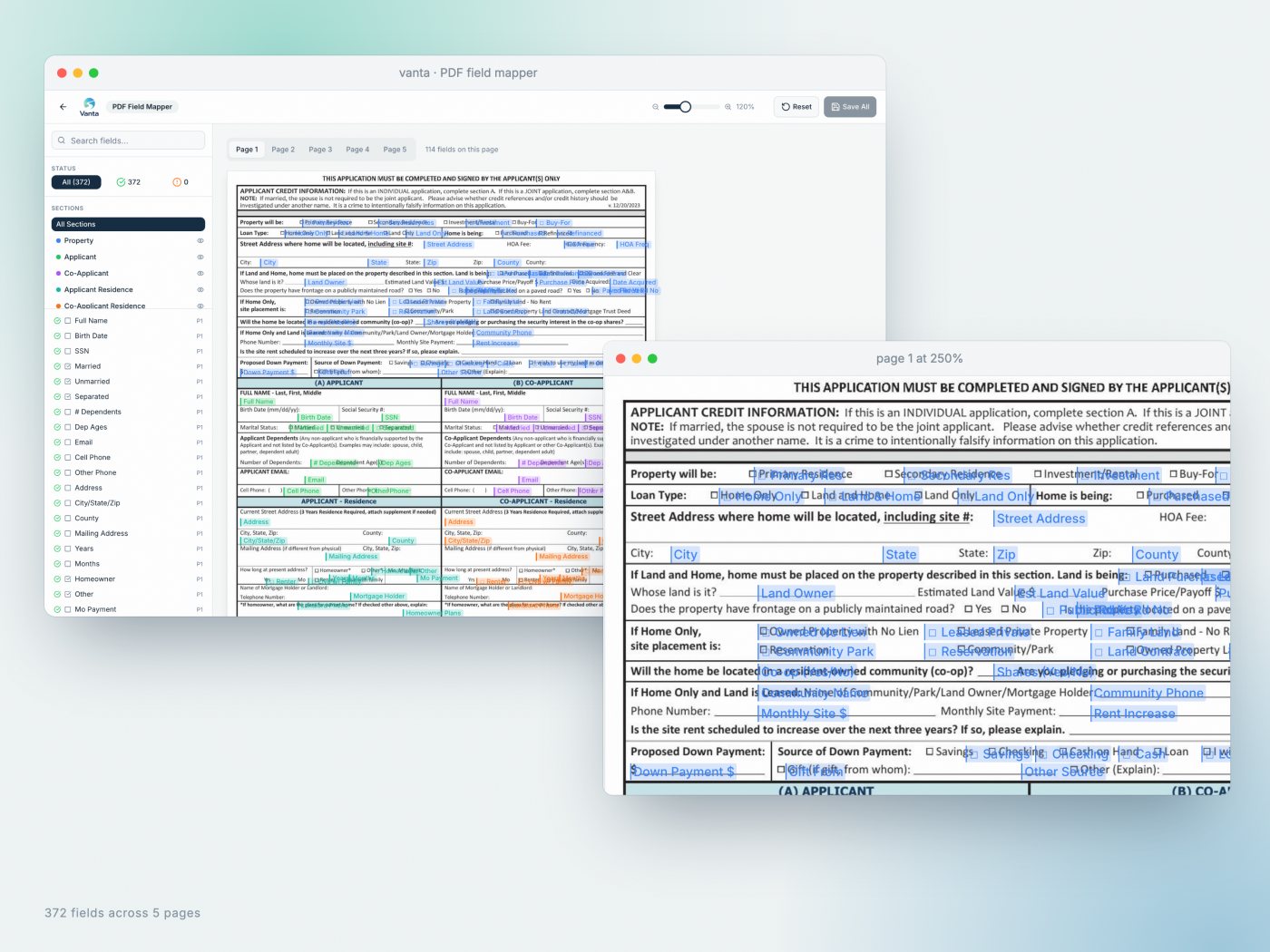
Every answer has to land in an exact spot on the lender's five pages: names in the right column, an X in the right checkbox, a dollar amount in the right cell. Rather than hard-code hundreds of coordinates, we built a field mapper for the dealer's staff.

It shows the lender's pages with every field as a coloured chip, grouped into 19 sections (applicant, co-applicant, residence, employment and so on). Staff drag a chip onto its box, nudge it with the arrow keys, or type exact coordinates, and it saves itself as they work. If the lender ever revises its form, the fix is moving chips, not rebuilding the app.

When a buyer submits, the system fills the form, draws the checkmarks and signature, adds the signature audit page, and sends the finished file on to the dealer's sales tools.

The field mapper: 372 fields across five pages, with a zoomed detail of page 1.
The back office

Know who needs a call today

The dealer's staff see every application in one list, with the buyer, their progress bar, where they live and a status. Ten statuses cover the journey, from in progress and submitted to contacted, approved and rejected. Any draft untouched for 48 hours is marked Abandoned, which is the list of people worth a friendly call.

Opening an application shows the summary, internal notes, and the actions staff actually need: mark as contacted, copy a link the buyer can use to resume, and export the filled form.

The staff dashboard with a submitted application open, and the buyer's "Welcome back" screen. Sample applicants.
Every dealer

One app, in every dealer's colours

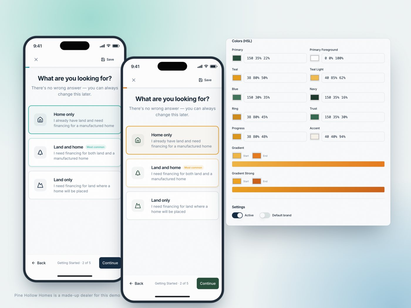
Bild Media works with many home retailers, so Vanta is white-label from the ground up. A brand manager holds each dealer's name, tagline, logo, support contacts and where submissions go, plus ten colours and two gradients with live swatches.

Each dealer gets its own address, and the whole experience takes on its brand: the landing page, every step of the application, the confirmation. Every application is tagged with the dealer it came through, so each one only follows up its own buyers.

The same step in Vanta's colours and a second dealer's, and the colour settings behind it. Pine Hollow Homes is a made-up dealer for this demo.
Looking back

What we'd do next

The core is built: the guided application, the filled lender form with its signature record, the staff dashboard and the dealer brands. A few pieces were designed in but left for later: inviting a co-applicant to fill in their own sections by email, reminder emails for drafts that stall, and email delivery of the finished file alongside the sales tools.

The lesson we'd carry to any form-heavy product: the paperwork can stay exactly as the institution needs it. The person filling it in never has to see it.

work like this

need a long, sensitive form people actually finish? let's talk.

you work with the people doing the work, from the first question to the last detail. tell us what you're making and where it's stuck.

next story
Morningstar Live Viewa safety-critical web interface that lives inside a solar charge controller and answers one question: is my system working?
→