
Brady UX
client · web · 2024Storytime AI

A home for stories,
easy to browse.

Storytime AI let families create personalised stories with their child as the hero. I designed the site architecture, the menu system, the content layout and the components, working alongside the company's in-house designer.

Role
Architecture, navigation, layout, components
Team
With the in-house designer
Platform
Web app, with a companion mobile app
visit storytimeaiapp.com ↗
4areas I owned: architecture, menus, layout, components
6sections in the side menu
2designers on the product: me and the in-house designer
The job

The skeleton, not the skin

Storytime AI was a story-generation platform for children: a parent and child make a personalised story, and the child is the hero. The company had its own designer on the visual side. My part was the structure underneath it.

That meant four things: where everything lives, how you move between it, how a story and its illustrations sit on the page, and the reusable parts every screen is built from.

1
Site architecturethe information hierarchy and navigation
2
Menu systemage-appropriate browsing for families and kids
3
Content layouthow stories and illustrations are presented
4
Component libraryreusable patterns for every screen
The four pieces of the product I was responsible for.
The home screen

Make a story, or pick one up

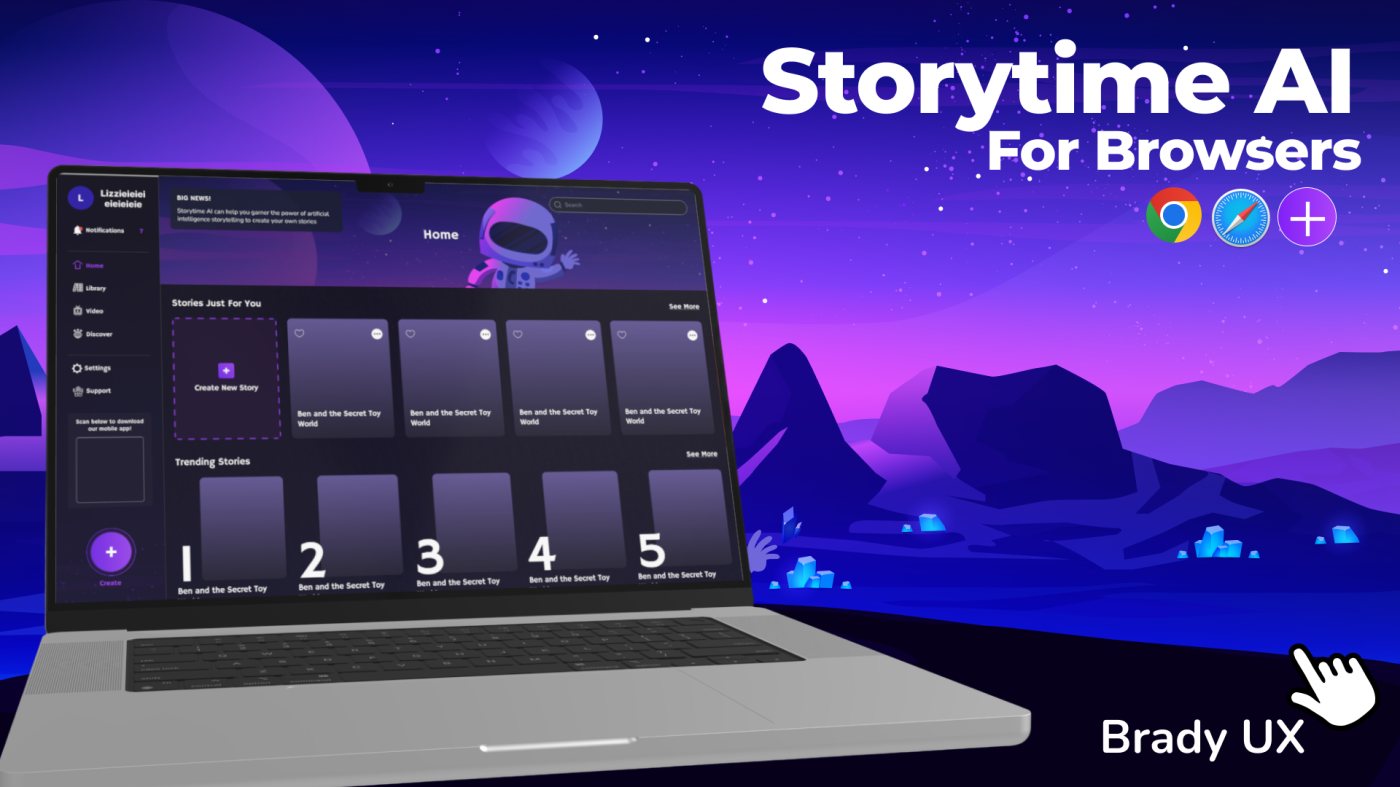
The home screen shows the structure at work. A side menu holds the six places you can go. The first row is personal, and its first card is always “Create New Story”, so making something new is never more than one tap away. Below it, trending stories are ranked one to five, so there's always something to read even before you've made anything.

Create also lives as a big button at the bottom of the menu, and the same menu points families to the mobile app.

01Side menuHome, Library, Video, Discover, Settings, Support
→
02Stories just for youstarts with a Create New Story card
→
03Trending storiesranked 1 to 5
→
04Createa button that's always in the menu
The home screen, top to bottom. You can see it in the image at the top of the page.
What happened next

The product moved on

Storytime has since changed direction. It's now a reading platform for K-12 classrooms and school districts, with a new website. The work here is the earlier family product, shown as it was designed, so I'm not linking to the site as it is today.

  1. 2024architecture, menus, layout and components designed
  2. Laterthe company refocuses on K-12 reading
  3. 2026a new site for classrooms and districts
Where this work sits in the product's story.
Looking back

Good structure travels

Working next to an in-house designer, my job was the part people don't see: where things live, how you get there, and the pieces everything else is made from.

When that's done well, the visual layer can change, and the product still makes sense.