Brady UX
unsolicited concept · mobile ordering · 2026Royal Farms Pull Up

The order went through,
nobody in the kitchen saw it.

An unsolicited concept by Brady UX. Not affiliated with or endorsed by Royal Farms. It started with a wait: one of us ordered ahead at a Royal Farms, the app said it worked, and the staff never knew the order had come in. Royal Farms runs one of the best-loved rewards programs in convenience retail, but its app is a generic template. So we read eleven store apps and about 150 real reviews, then designed an order-ahead app for drivers, built around the one moment the current one gets wrong.

Role
Research, UX and UI (self-initiated)
Status
Concept · not affiliated with Royal Farms
Shown with
A sample order, prices and points
11store apps audited, from Wawa and Sheetz to Royal Farms' own
~150real reviews read, word for word
#1Royal Farms' rewards program among 20 c-store programs (Newsweek, 2025)
8screens, designed for one thumb in a parked car
The wait

An order the kitchen never saw

The order went through and the payment cleared. At the counter, nobody knew it existed, and there was nothing on the screen to show them. So the wait just went on.

It wasn't a one-off. One of the most-agreed-with reviews of the app, marked helpful by 129 people, asks Royal Farms to give app customers a store order number "or they will be waiting forever."
01Orderplaced in the app and paid
→
02Kitchennever sees it come in
→
03Counterno order number to point to
→
04Waitstanding there, wondering
↺ the moment every screen in this concept is designed around
What happened, in the order it happened.
Great program, weak front door

The best rewards in the category, behind a template

Royal Farms' rewards program scored 9.74 in Newsweek and Statista's 2025 ranking, the highest of 20 convenience-store programs and ahead of Wawa and Sheetz. People love the program.

The app in front of it is a white-label template, the same one other fuel brands use, with ordering handled by a separate web storefront. The written reviews are mostly about login codes that never arrive, an "error validating basket" message with no way forward, and stores the app can't find.

Royal Farms9.74
QuickChek9.3
Wawa8.41
Sheetz8.1
7-Eleven7.81
Newsweek / Statista, America's Best Loyalty Programs 2025, convenience stores.
What we read

Eleven apps, and what their customers keep asking for

We audited Wawa, Sheetz, Rutter's, 7-Eleven, Casey's, GetGo, Buc-ee's, Kwik Trip, Cumberland Farms, Circle K and Royal Farms itself, reading the App Store and Google Play reviews word for word. The same requests came up across every brand.

The industry numbers point the same way. In a 2026 mystery-shop study of nine restaurant brands, one in five mobile orders wasn't ready on time, and only 65% of locations had a clearly marked pickup area.

1
Let me inlogin and texted codes fail more than anything else
2
Tell me the truthorder status from the kitchen, not a timer
3
Make pickup obviousa code, a shelf, a way to reach a person
4
Keep my storenever switch it quietly
5
Fuel and food togethergas discounts are why people download the app
The top asks, from roughly 150 real reviews across 11 apps.
what would you ship?

How does a customer know the kitchen actually has their order?

Timer bars lie. One 7-Eleven customer in our review set watched theirs sit at "in progress" for over two hours. Status that comes from a person in the kitchen can't claim progress that isn't happening.

The kitchen has to see it

A real person taps "got it", and you see their name

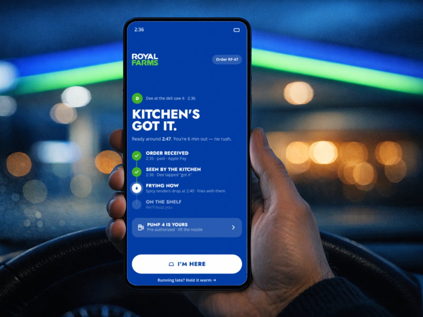
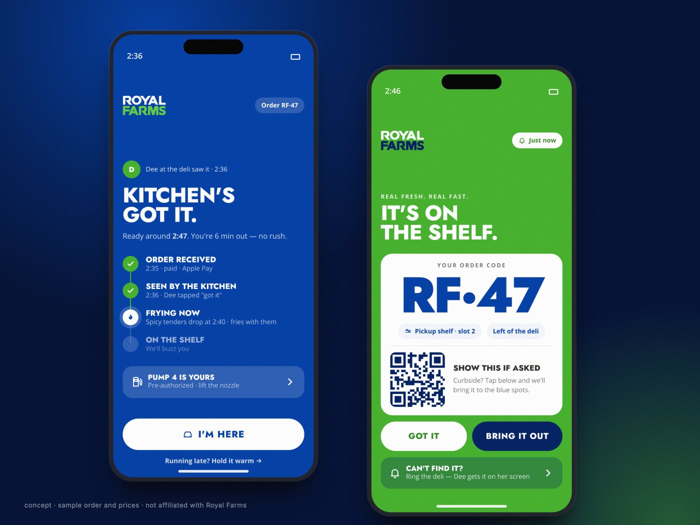
The status screen is the one their current ordering is missing. When someone on the line taps "got it", the customer sees who and when: "Dee at the deli saw it, 2:36." The steps that follow come from the kitchen too, so the screen never claims progress that isn't happening.

Pickup is built to be impossible to miss. Green means go. The order code is huge, next to the exact shelf slot and where that shelf is. If the bag isn't there, one button pages the deli, and "Bring it out" turns it into curbside.

Live status and pickup. Sample order and staff name.
what would you ship?

A driver needs gas and lunch. One flow or two?

It's the same trip. In a 2022 survey, 86% of people said gas discounts were why they downloaded a c-store app, so the pump belongs on the same screen as the food.

Order in three seconds

Built for a driver, not a browser

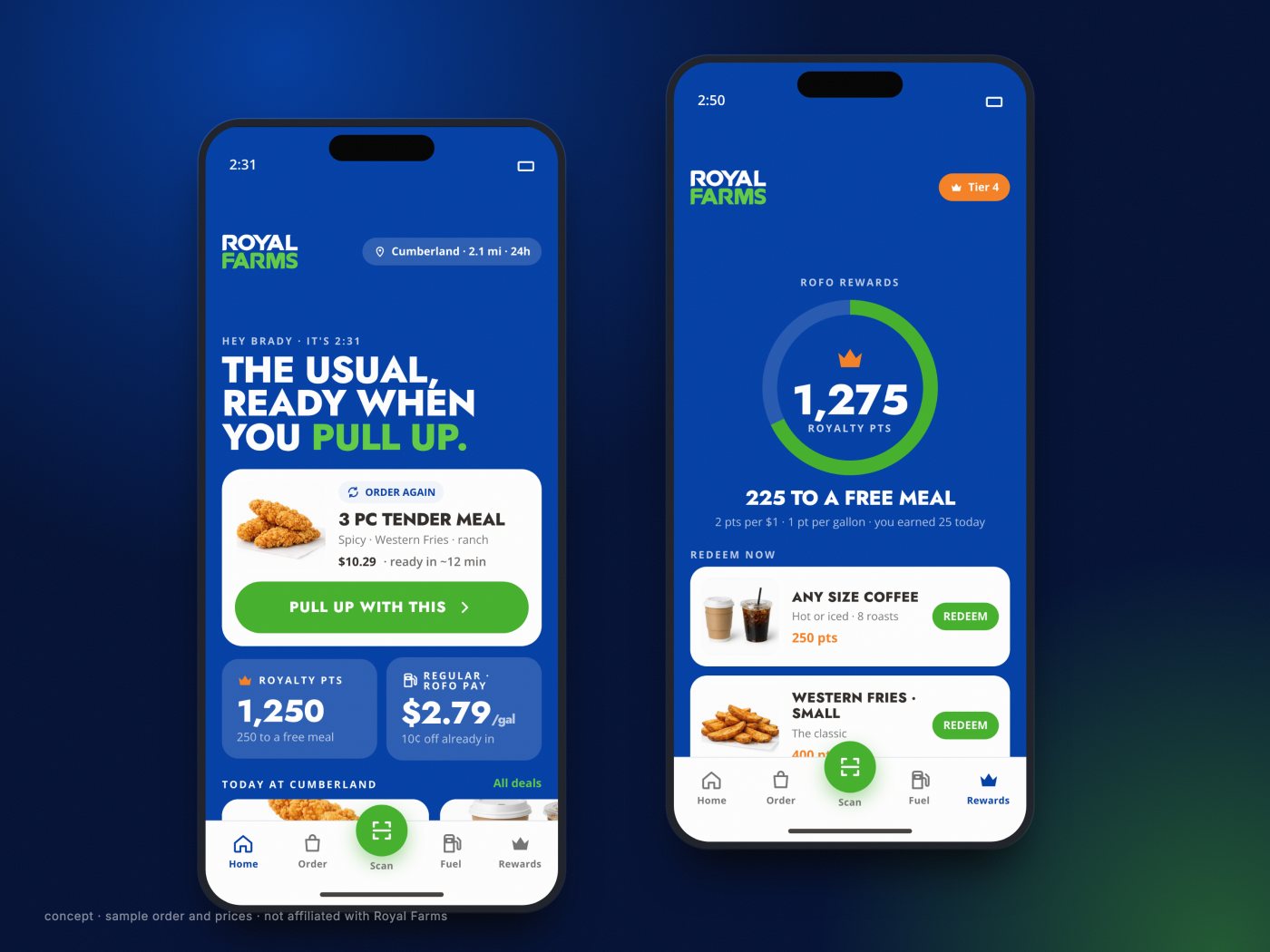
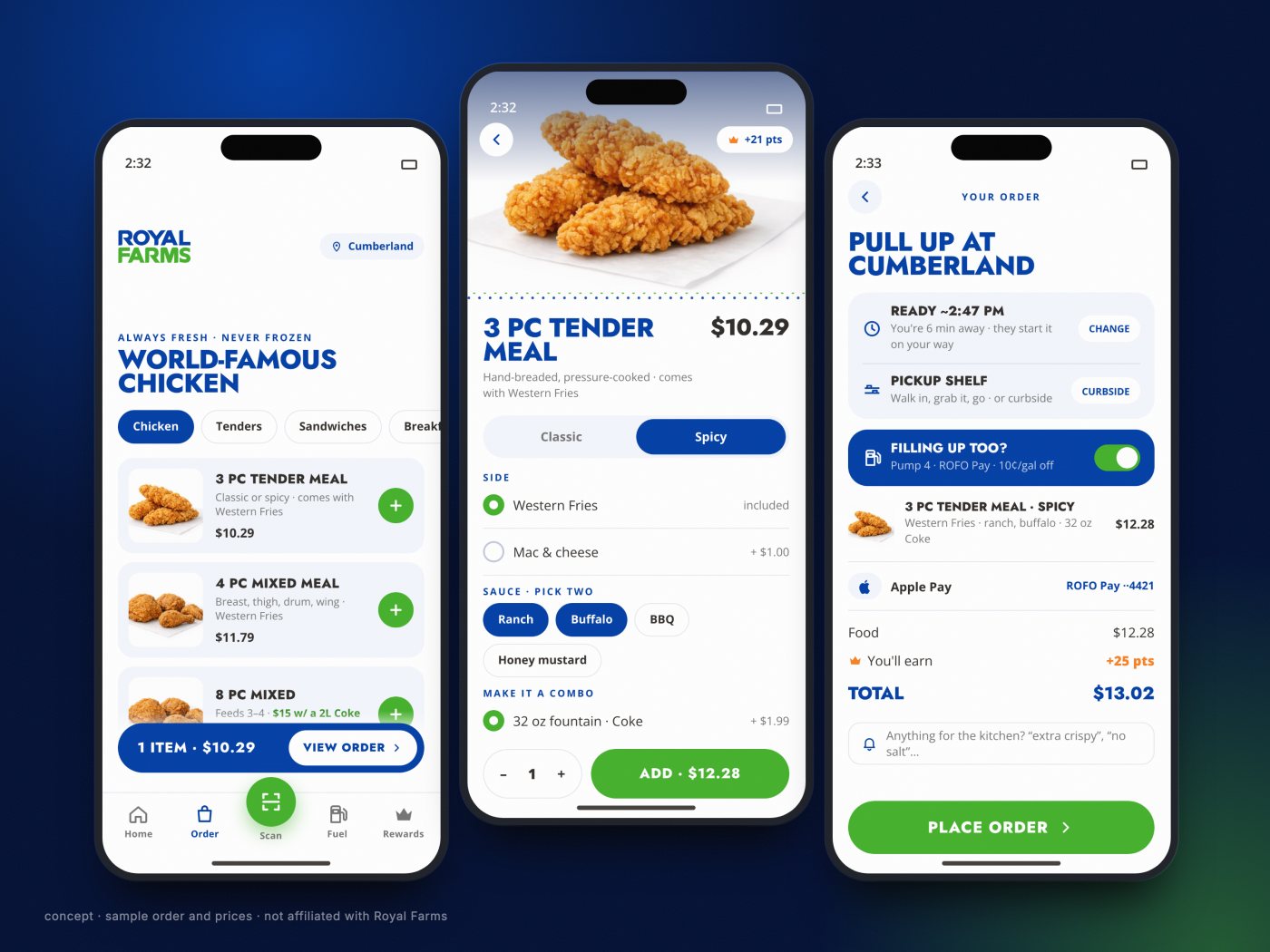
Home leads with the usual order, ready in one tap, next to the store, the ready time and today's fuel price. The menu puts chicken first and adds any item in one tap. An item takes four decisions, with the price always in view.

Checkout is already filled in: the time, the shelf, the payment. Fuel rides along on the same order. Pick your pump, the ROFO Pay discount is already applied, and the pump is ready when you pull in. One stop, one screen.

Menu, item and checkout. Sample prices.
Their brand, used with confidence

Blue canvas, green for go, the crown only for points

The concept uses Royal Farms' own palette: royal blue, a bright green and a navy, with the orange crown kept for Royalty Points and nothing else. On blue, the wordmark is white and green, the way it appears on their pump housings.

That gives the crown a job. Rewards opens on a points ring and the distance to a free meal, and you redeem right next to the things you already order.

Home and rewards. Sample points.
Looking back

What we'd do next

The "got it" tap means someone in the kitchen needs a screen of their own. That's the next thing to design, with the people who would use it on a busy lunch rush.

After that: test the flow with real drivers at a single store, and borrow the one idea from the audit we'd add first, a home screen that changes when you arrive at the store.

work like this

need research-led product design, from 150 real reviews to 8 screens? let's talk.

you work with the people doing the work, from the first question to the last detail. tell us what you're making and where it's stuck.

next story
out louda course that teaches you to say it out loud.
→