Brady UX
my product · job search · 2026pirch

Fewer jobs,
the right ones.

pirch is a job hunter for people who are tired of the spray. You drop in who you are, it reads hundreds of live listings, throws out the dead ones, and comes back with a few that genuinely fit, each with its reasons and a cover letter in your voice.

Role
Founder: product, brand, design
Live
pirchjobs.com · web and iOS
Since
June 2026
visit pirchjobs.com ↗
~450live listings read and link-checked on every hunt
~40sfrom "hunt" to a short list with reasons
0applications sent for you. You stay in control.
72 hfreshness window on every public verified job
The problem

Job boards reward volume, so everyone plays volume

pirch started with my own job search. The listings were full of reposts, expired roles and links that died before I clicked them, and the tools built on top made it worse by automating the spray: hundreds of applications fired into the void.

Nobody was competing on the other axis: fewer, truer, checked. That's the same thing I sell to clients, quality with a name on it, pointed at the job hunt. So the whole product is a bet on restraint. It never applies for you. It hands you a short list and gets out of the way.
01Drop in who you area resume, links, projects, how you write
→
02Read the live markethundreds of fresh listings from several job feeds
→
03Check every linkdead, expired and unreachable listings are thrown out
→
04Read for real fitthe finalists are re-ranked on who you are, not keywords
→
05Hand you a fewmatch %, why it fits, an honest heads-up, a cover letter
↺ you apply yourself; pirch never sends anything on your behalf
One hunt, start to finish.
The input

A conversation, not a profile form

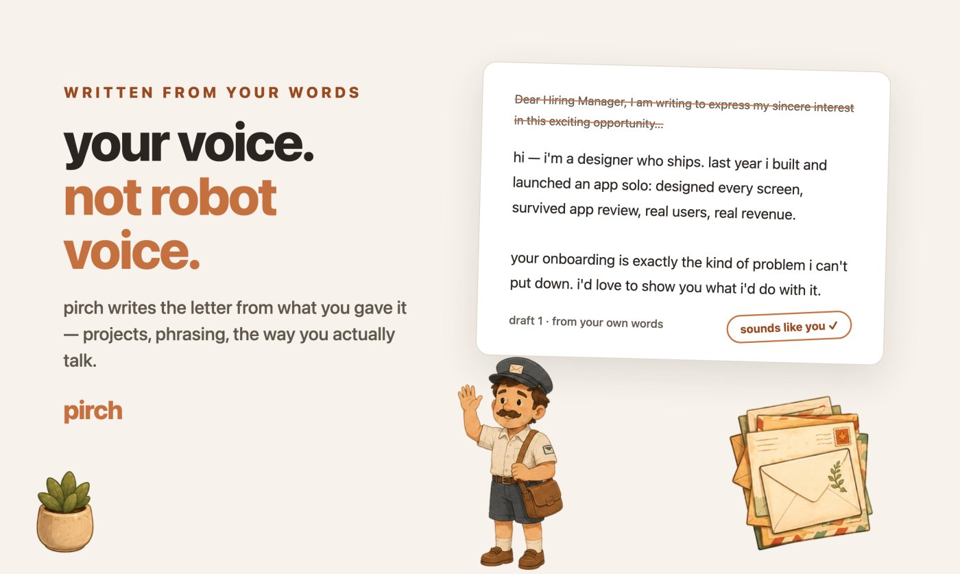
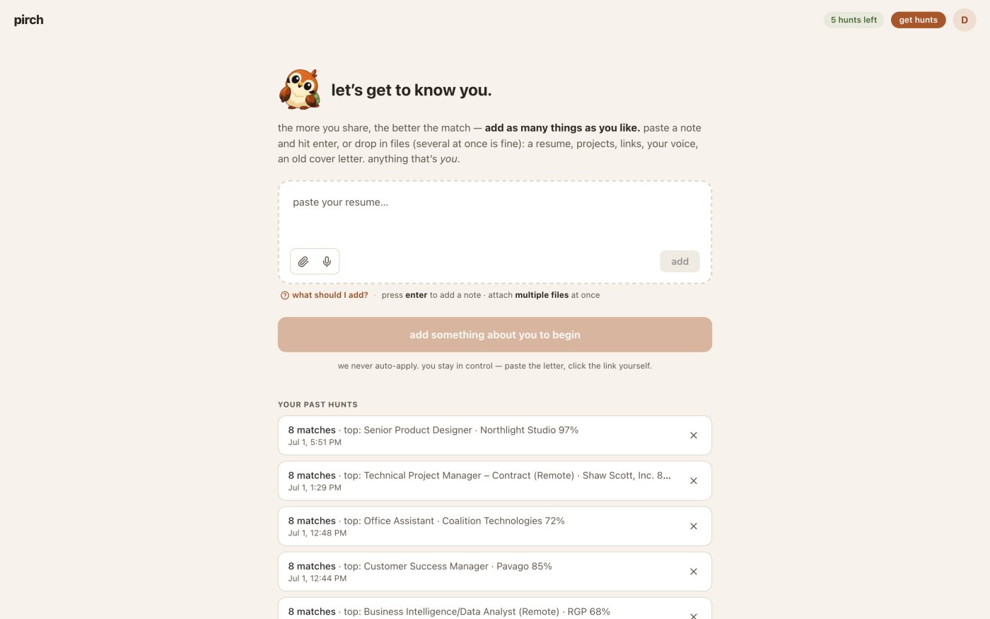
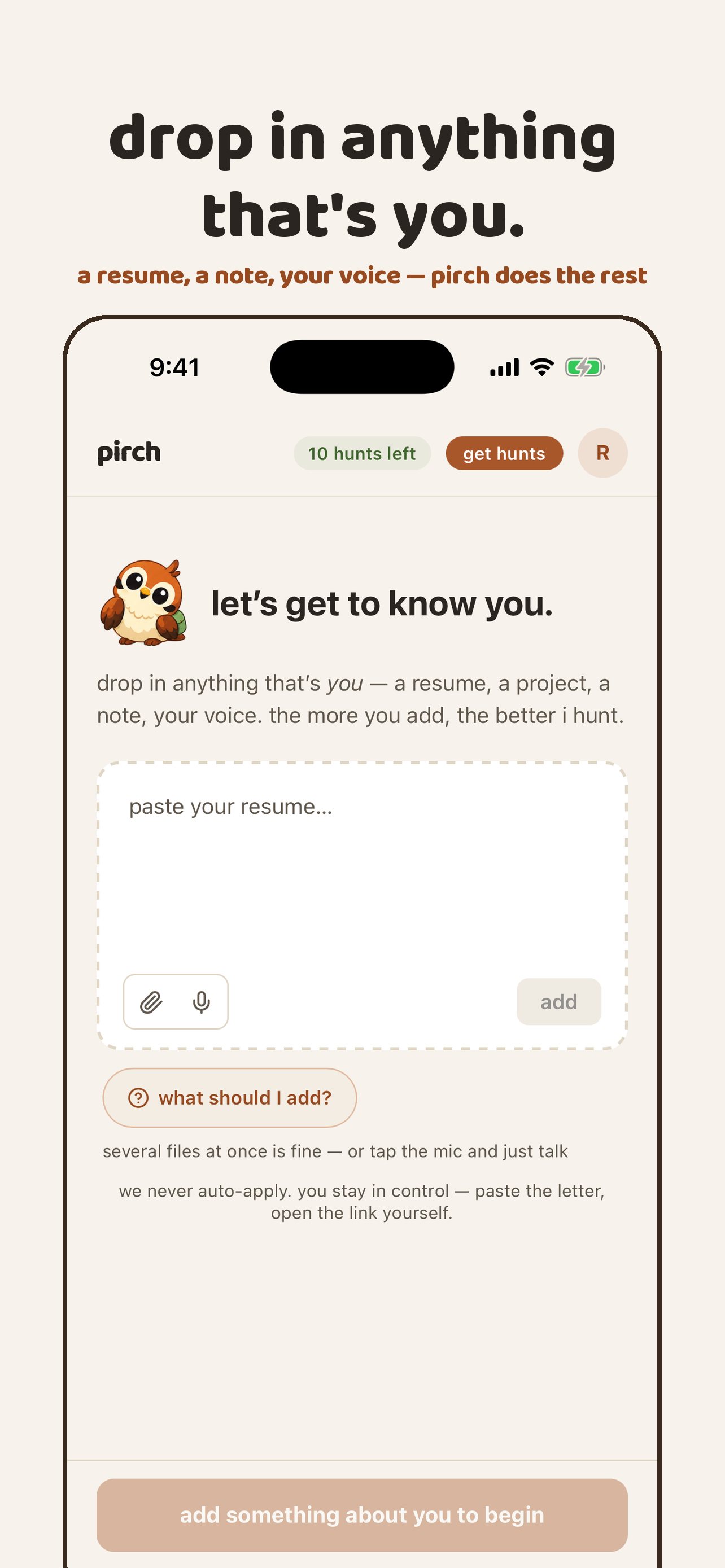
The scariest screen in any job tool is the empty profile. I replaced it with the nest: one box that takes anything that's you. Paste your resume, drop in a portfolio PDF, add a cover letter you were proud of, or a note about how you like to write. The more you share, the better it reads you.

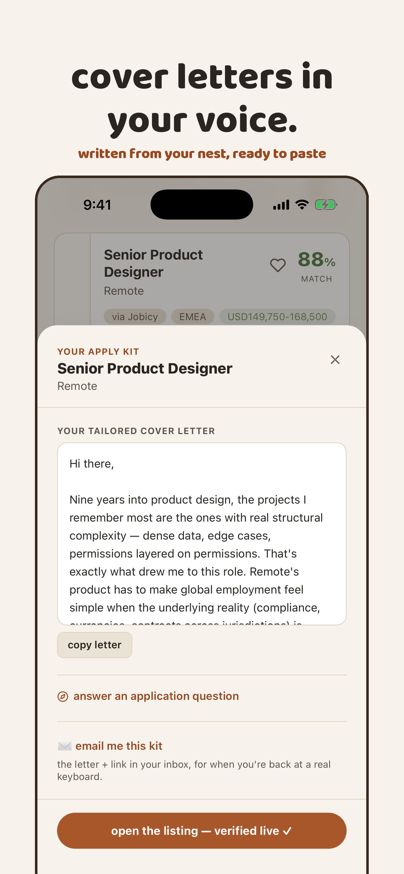
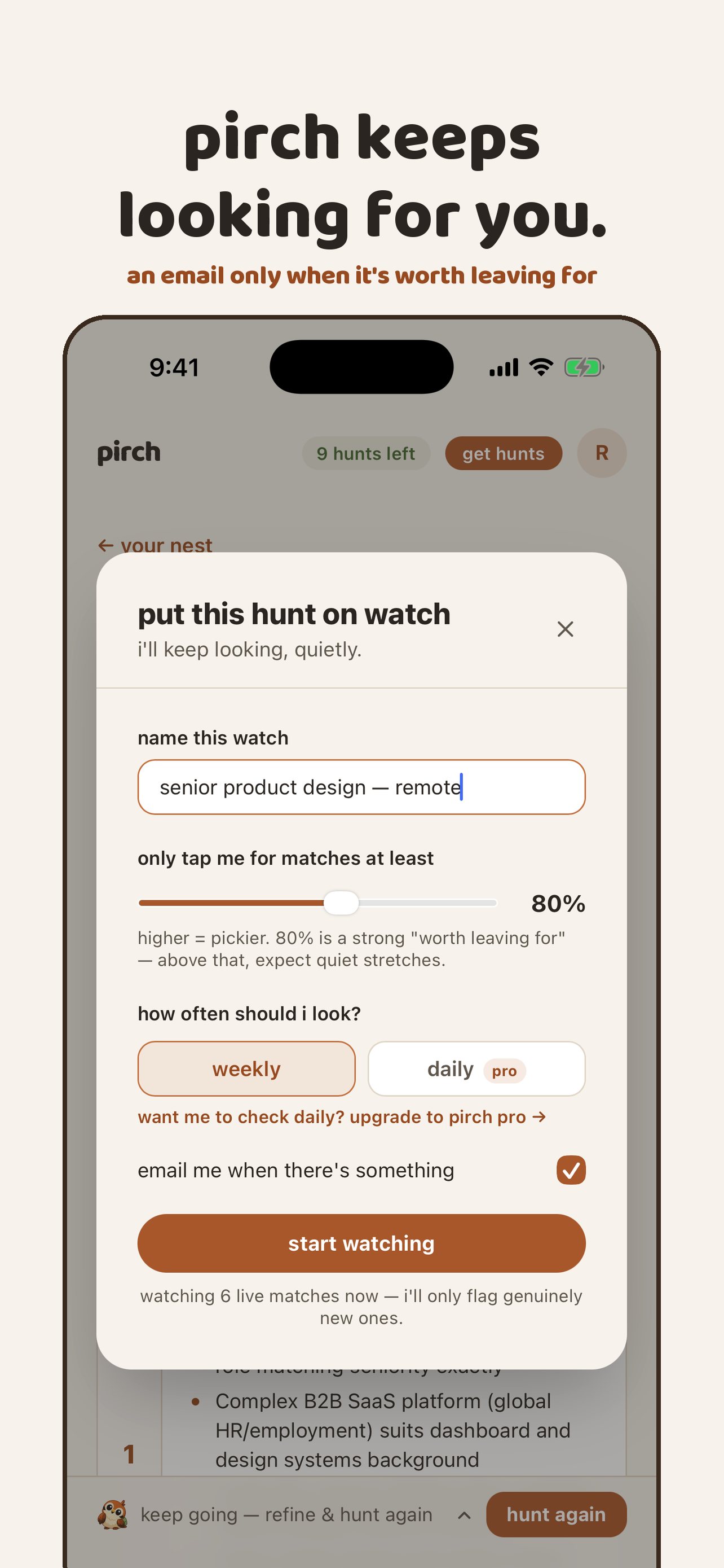
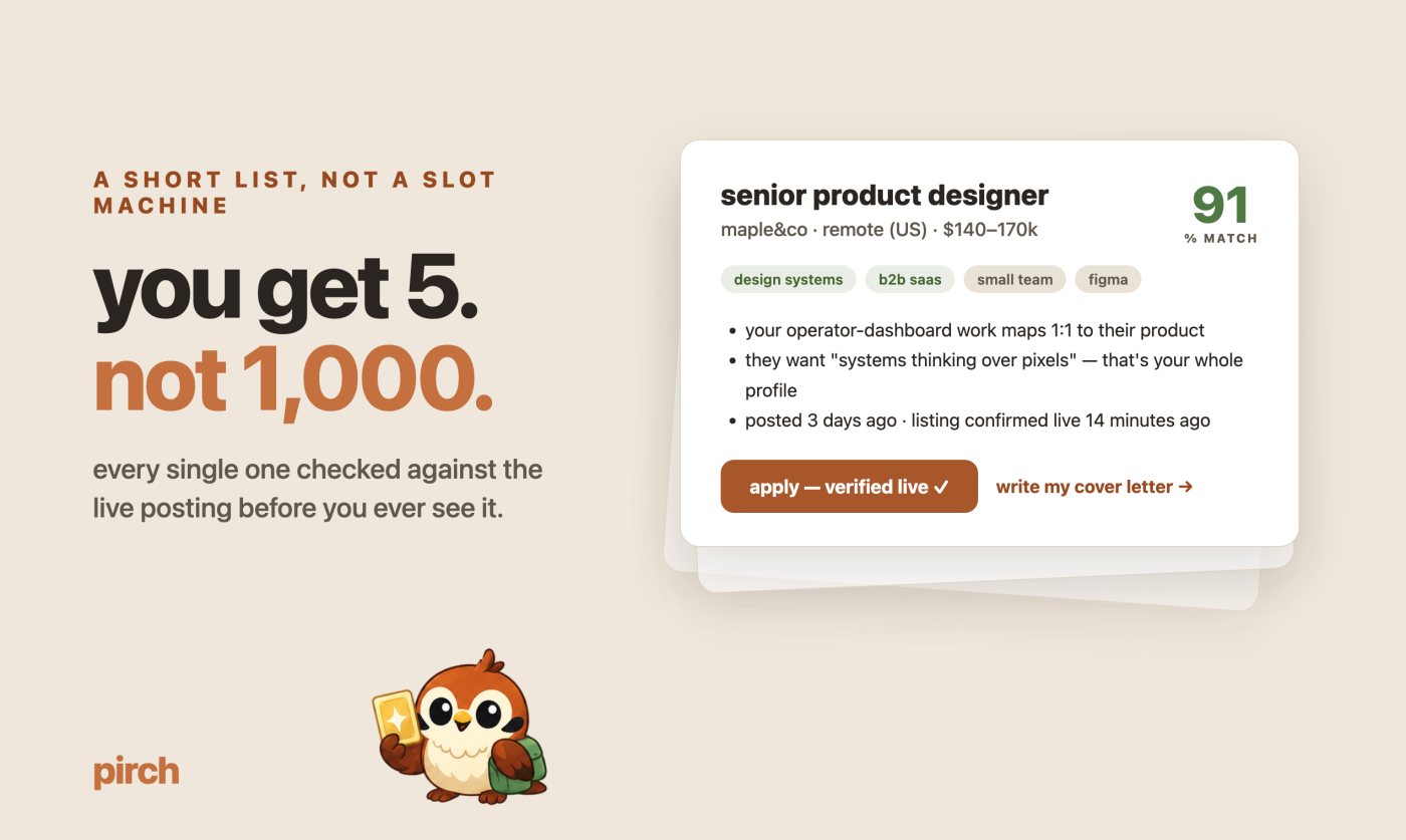
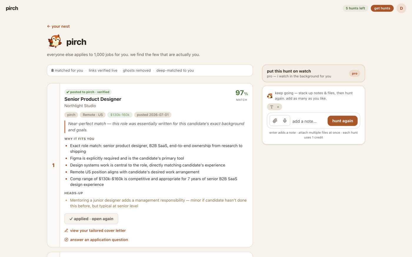
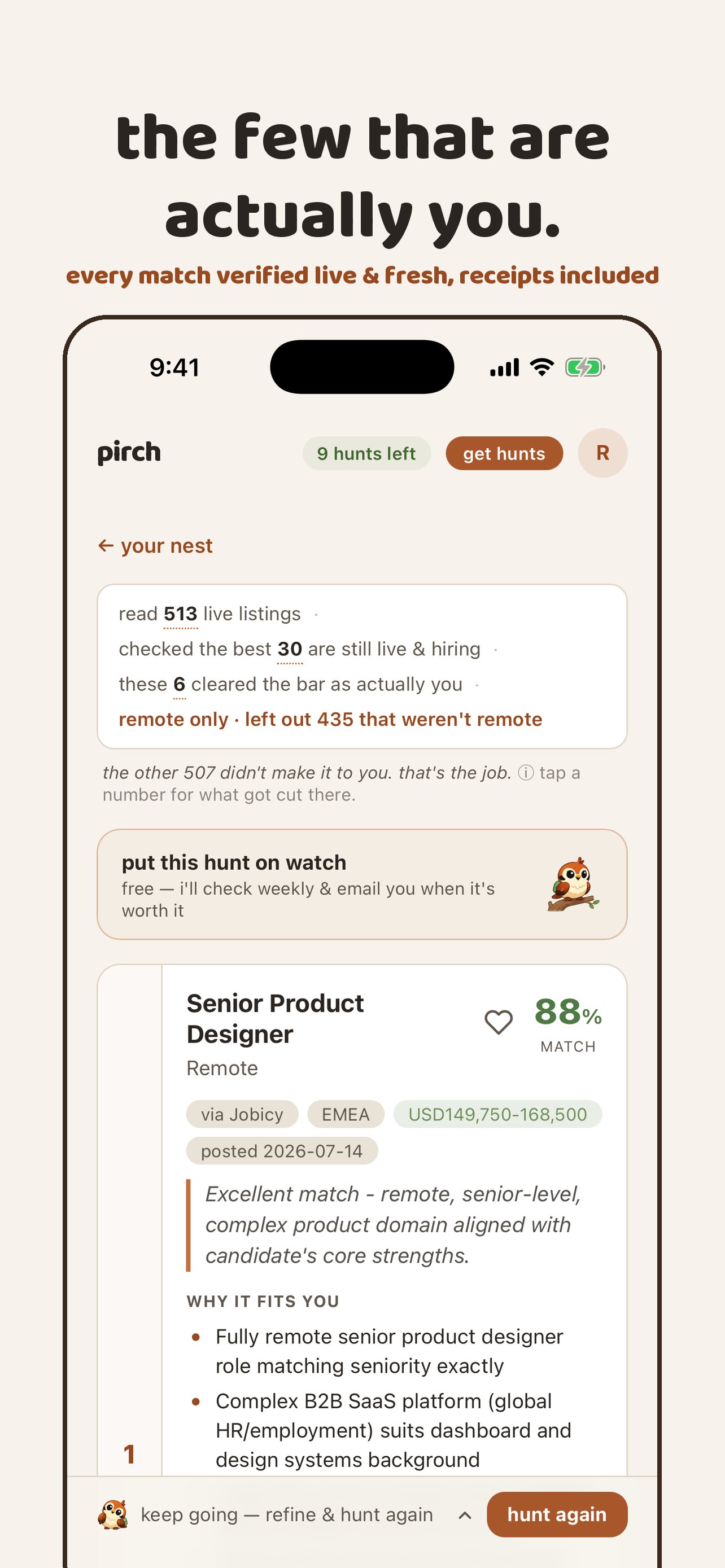
Every match then carries its receipts: the score, the specific reasons it fits, a plain note where it doesn't, a link that was checked moments ago, and a letter written in your own register. Paying members can put a hunt on watch, and pirch quietly re-hunts and emails only when something new is worth their time.

The nestThe nest
The short listThe short list
A letter in your voiceA letter in your voice
A hunt on watchA hunt on watch
The core loop on iPhone, as it appears on the App Store.
The brand

Warm on purpose

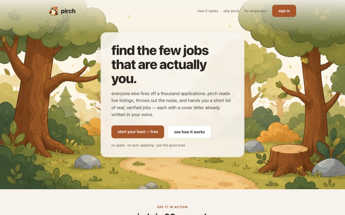
Job hunting is anxious and low-trust, so the product's calm is part of the pitch. pirch lives in a hand-illustrated storybook forest, with a small sparrow carrying a green explorer's backpack: a picky hunter, not a frantic one. The voice is lowercase, plain and a little dry.

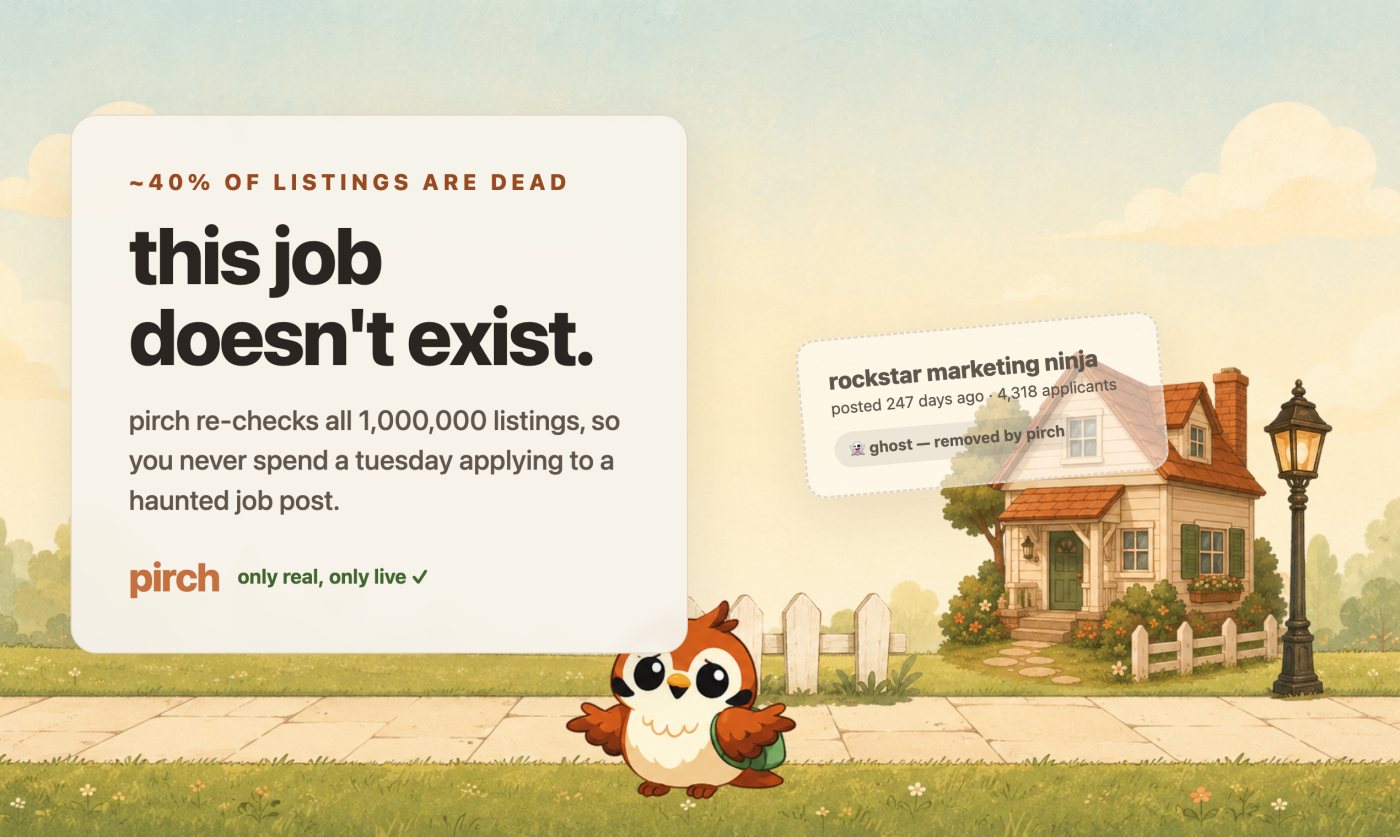
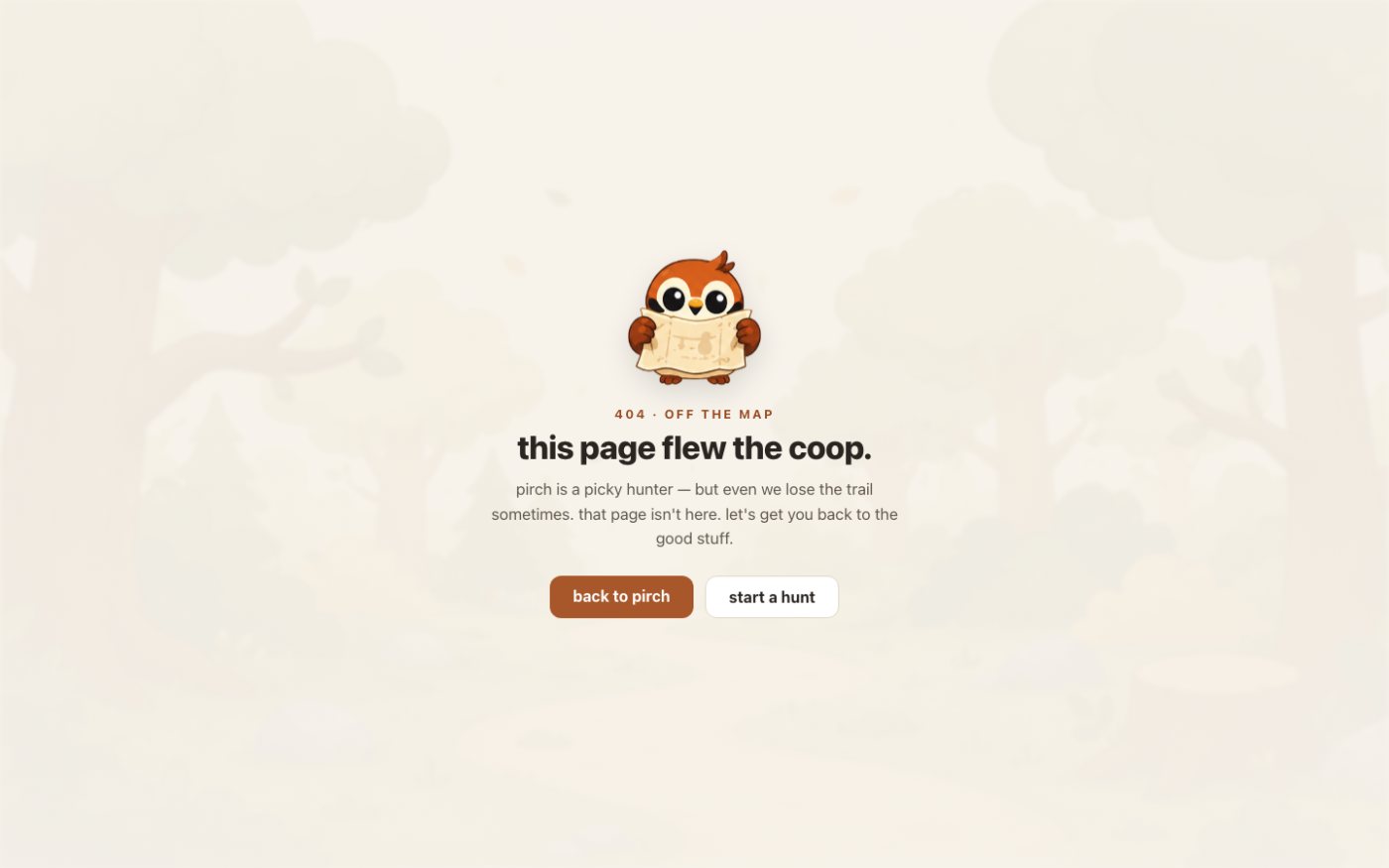
The bird is seasoning, not the meal. It shows up in empty states, the loading screen and the 404 page (lost, with a map), and never twice on one screen. The product stays professional first.

A short list, not a slot machineA short list, not a slot machine
Checked live and freshChecked live and fresh
Your voice, not robot voiceYour voice, not robot voice
The 404: this page flew the coopThe 404: this page flew the coop
Launch gallery art and the 404 page. Same palette, same bird, same voice.
Accessible by rule

One colour, three strengths

The first version of the homepage had text sitting straight on the forest painting. It looked lovely and read badly. That became the one rule the whole system is built around: text never sits directly on an illustration. It goes on a surface, a panel, or a scrim of 90% or more.

The brand rust had the same problem in miniature. White text on the plain rust only reaches about 3.3:1, which fails for normal text. So the colour comes in three strengths, each with a job, and every pairing in the app and the site meets WCAG AA.

1
rust · #c4703flarge display, icons and tints only; never small text
2
rust-strong · #a8572bbutton fills with white text (about 5.1:1)
3
rust-ink · #97491fsmall accent text on cream: eyebrows, links, badges
From the pirch design system, the single source of truth for the app and the site.
Shipped

Launched hardened, not just launched

The happy path is the easy part. Before anyone outside could hunt, pirch had per-person limits, a global daily cap and a pause switch, so a busy day could never become a runaway bill. Background watches ran on the same matching engine as live hunts, with their own spending ceiling.

Then came the parts that make it a real product: an employer channel where posted jobs are reviewed by hand and blended in with a verified badge, a design-focused landing page with a live shelf of checked design jobs, and a native iPhone app.

  1. Jun 30named, and the first live hunts
  2. Jul 1watches, cost caps, the employer channel
  3. Jul 21pirchjobs.com/design for designers
  4. Jul 29first iPhone build in testing
  5. Aug 19live on the App Store
2026.
What the numbers said

The problem wasn't the paywall. It was the second visit.

When I measured the real funnel, the story was not the one I expected. People were not bouncing off pricing; almost nobody got that far. Most of them left with free hunts still in hand. And it wasn't the results: people who never came back had been served slightly more matches on average than people who did.

Nothing was pulling them back. The best-performing email was a simple check-in after the first hunt, clicked about five times as often as the overnight digest, and it was the one being sent least. So the work moved from checkout to the return visit: send the check-in to everyone who earned it, and turn the noisy digest down.

Signed up182
Ran a hunt114
Ran a second60
Came back another day34
Marked a job applied27
Real accounts only, test accounts excluded, measured 2 August 2026.
Looking back

What I'd tell another founder

The idea is cheap now. Plenty of tools make the same promise about fewer, verified jobs. What can't be copied is a point of view: the voice, the restraint, the warmth, and a product that says what it believes instead of comparing itself to anyone.

And measure before you optimise. I could have spent weeks on pricing pages. The numbers said the real work was giving people a reason to come back.