Brady UX
my products · editorial design · 2026Blogs

Three brands,
three blogs, every post gets its own cover

I design and run the blogs for TasteOS, pirch and tab. Each one looks like the product it belongs to: its own art style, its own voice, its own post layout. And every single post gets a cover made just for it.

Role
Editorial design, art direction, writing
Blogs
TasteOS · pirch · tab
Live
tasteos.app/blog · pirchjobs.com/blog · tabwork.app/notes
visit tasteos.app/blog ↗
3blogs, each designed in its own product's brand
88posts and notes written across them so far
3×a week, the TasteOS blog publishes, on a calendar planned around the seasons
1,165job listings pirch re-opened for one original study
The idea

A blog should look like the product it sells

Most product blogs share one look: a grid of stock photos and a wall of text. Nobody remembers whose blog it was. I wanted each of mine to be recognisable from across the room.

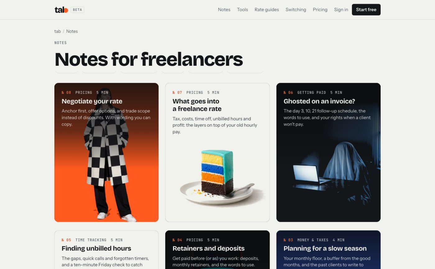
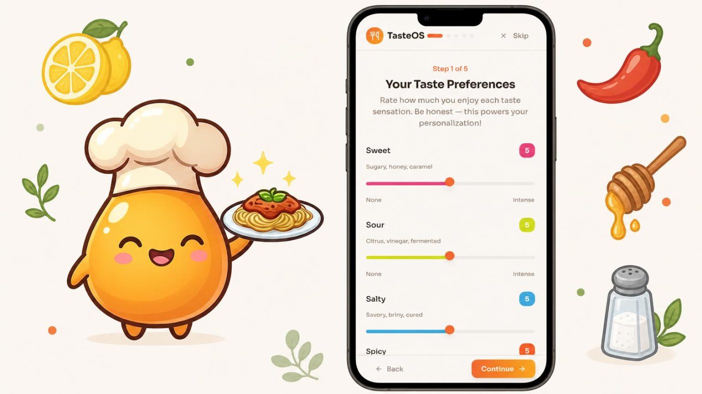
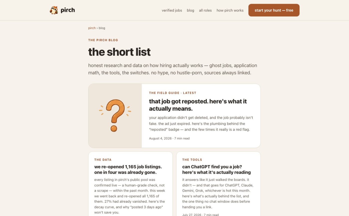
So each blog borrows everything from its product. TasteOS is warm and illustrated, with its mascot cooking in every picture. pirch is quiet and lowercase, built like a research notebook. tab is dark and bold, with art that moves. Same job, three very different rooms.
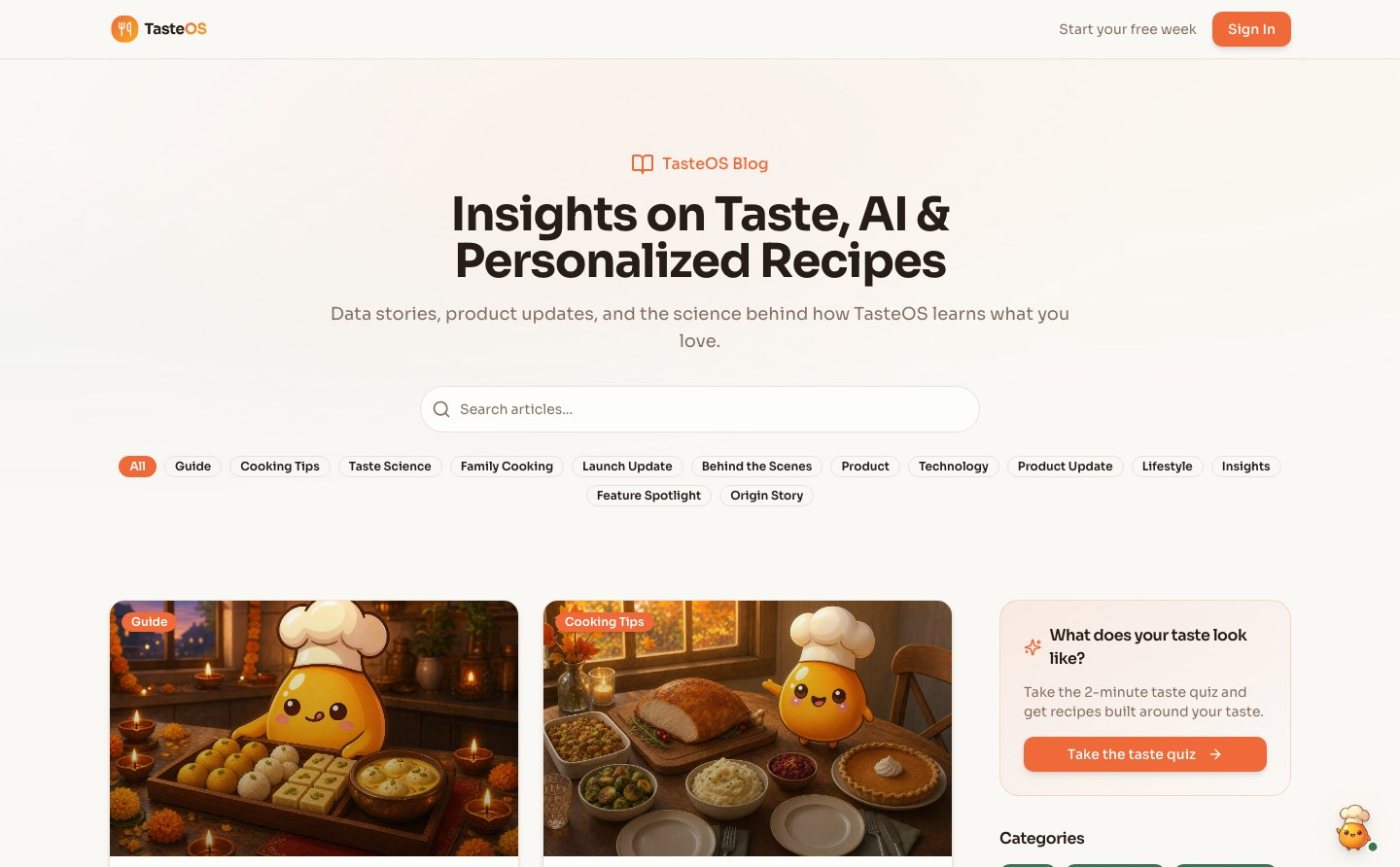
TasteOS · tasteos.app/blogTasteOS · tasteos.app/blog
pirch · the short listpirch · the short list
tab · notes for freelancerstab · notes for freelancers
The three index pages, live.
what would you ship?

The blog's first covers were photo-style scenes of people cooking. What should the covers be?

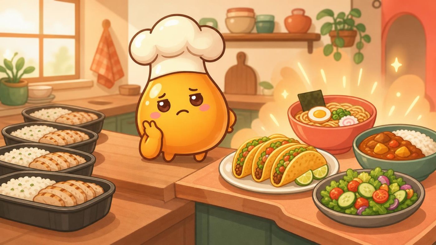
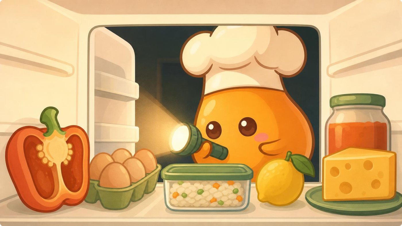
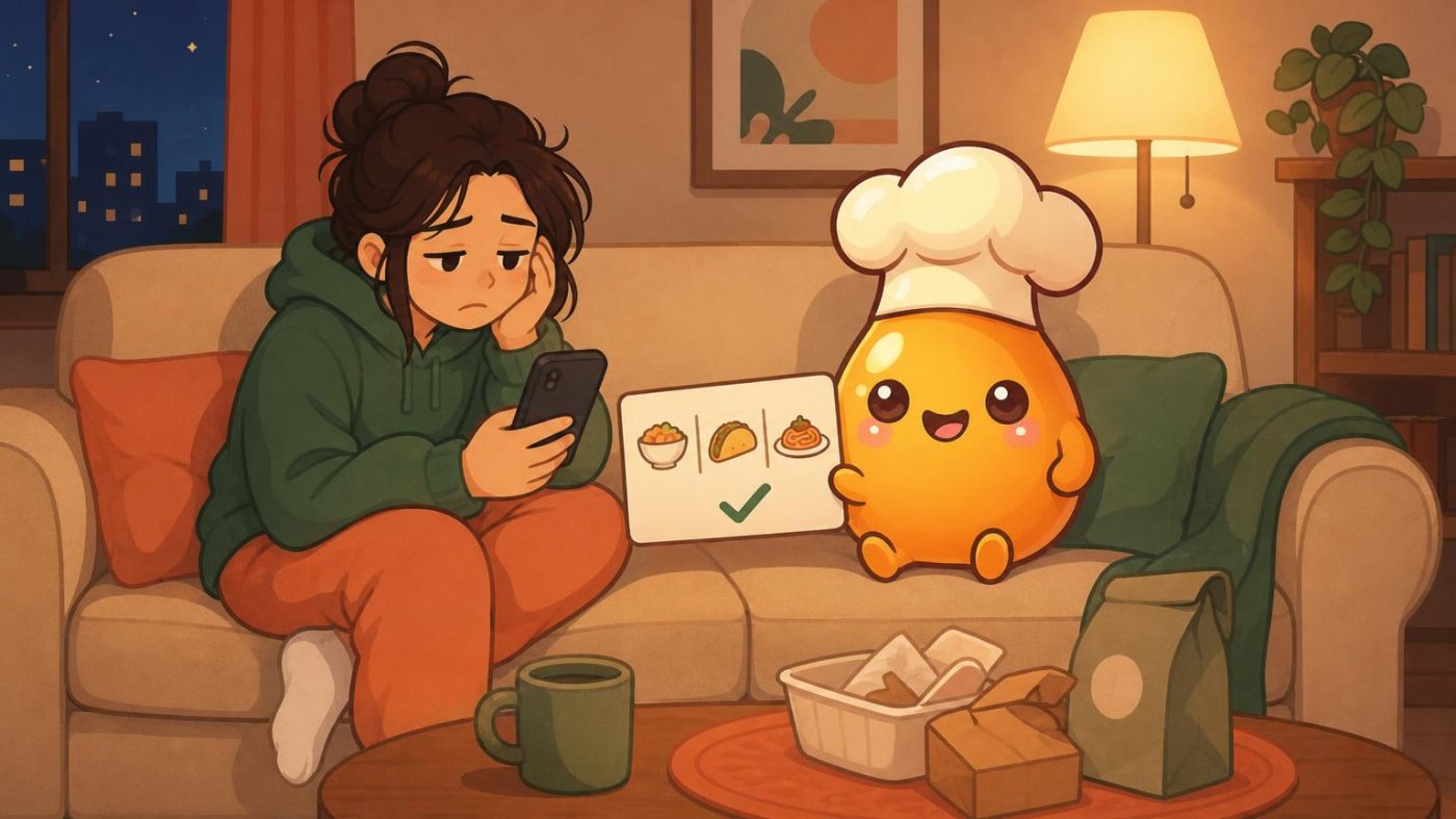
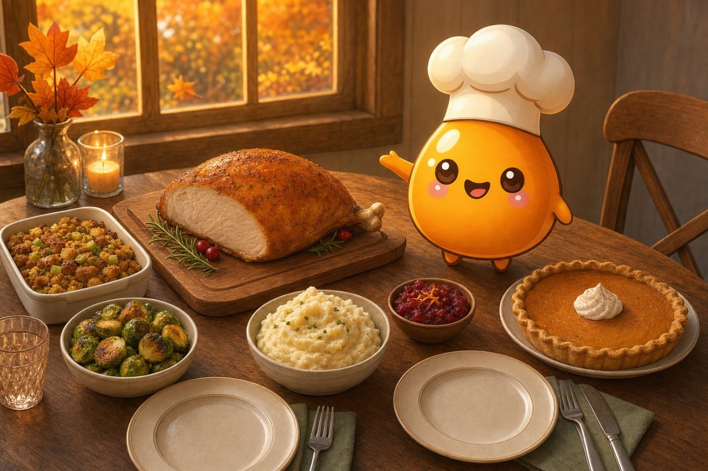
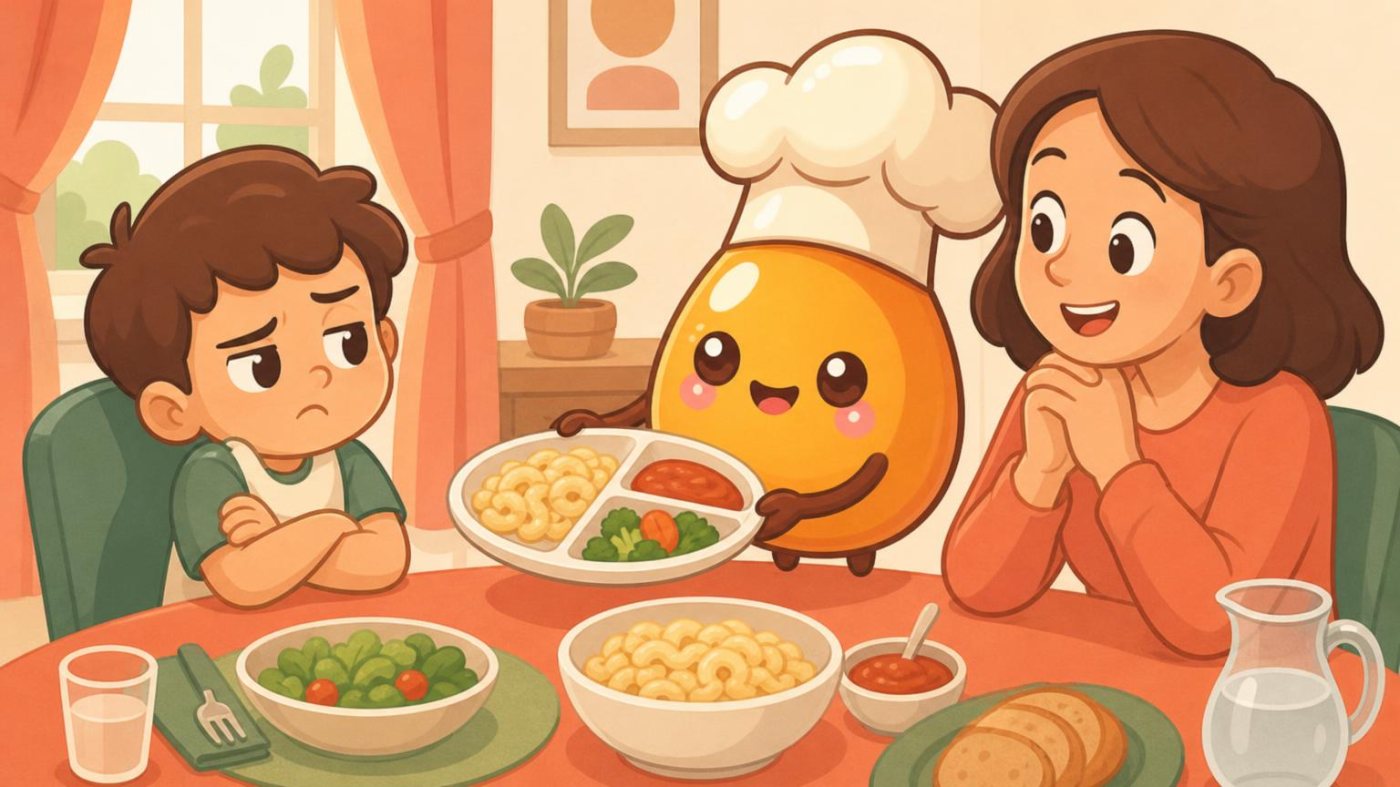
The photo-style covers could have belonged to any food blog. Now every cover is one painted scene with Tastey in it, painted from the app's own character art, so the picture says TasteOS before the headline does.

TasteOS covers

Tastey is in every picture

The TasteOS blog started with photo-style covers of people in kitchens. They looked fine, and they looked like every other food blog.

Now every cover is one painted scene that tells the post's idea, with Tastey, the app's mascot, in the middle of it. Each scene is painted from the app's own character art, so Tastey is always on-model. A cover gets redone if Tastey looks off, if any lettering comes out garbled, or if anything about the character is wrong.

Diwali sweets, made aheadDiwali sweets, made ahead
Thanksgiving for twoThanksgiving for two
What should I eat tonight?What should I eat tonight?
What is a flavor profile?What is a flavor profile?
Dinner for picky eatersDinner for picky eaters
The fridge formulaThe fridge formula
Meal prepMeal prep
Behind the scenesBehind the scenes
One scene per post, always the same character.
TasteOS posts

Every post leads to the taste quiz

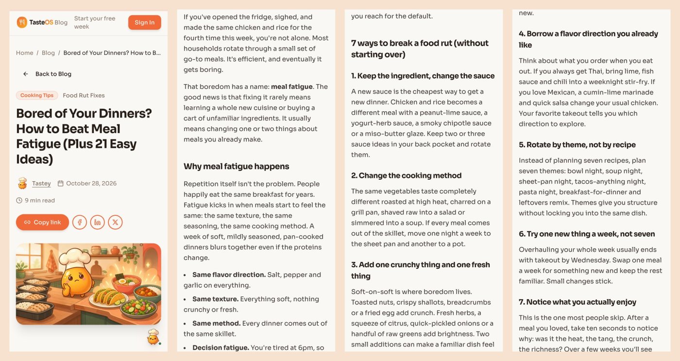
A TasteOS post is long and useful first: real recipes, real amounts, a plan you can follow tonight. The layout carries it with headings, lists, callouts and stat blocks, so you can skim straight to the part you came for.

Then it hands off. The taste quiz shows up halfway down and again at the end, and the share buttons sit at the top and the bottom. Shared links open a proper preview card with the cover on it. That path works: TasteOS's first yearly subscriber came from Google, to a blog post, to the quiz, to the paywall.

Posts go out three times a week, timed to the calendar. Seasonal posts go up four to six weeks before the day so they have time to be found. Each one gets a second read against a checklist before it publishes, and that read has caught real food-safety mistakes.

The first four screens of a post on a phone: cover, share bar, then the article.
pirch covers

One small object, a lot of quiet

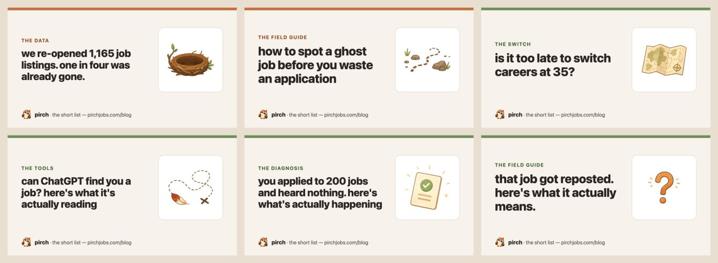
pirch is a job-search tool with a sparrow for a mascot, and people searching for jobs are already tired. So the short list is calm on purpose: warm paper, lowercase headlines, and one small object from pirch's world per post. A map, a nest, binoculars, a postcard. The bird appears at most once on a page.

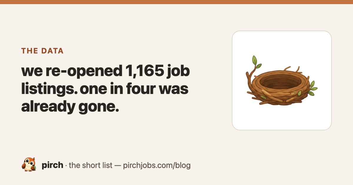
Every post also gets its own share card, built from the same parts, so a link to pirch looks like pirch wherever it's posted.

Share cards for six posts. The kicker on each one names the kind of post: the data, the field guide, the switch.
what would you ship?

Ten posts on the same blog. Should they all share one layout?

Every pirch post has to use a different sequence of blocks (stat cards, charts, comparisons, myth checks, verdicts), and the accent colour alternates between rust and green. Readers who come back get a new shape each time, not a template.

pirch posts

Built like research, with the receipts

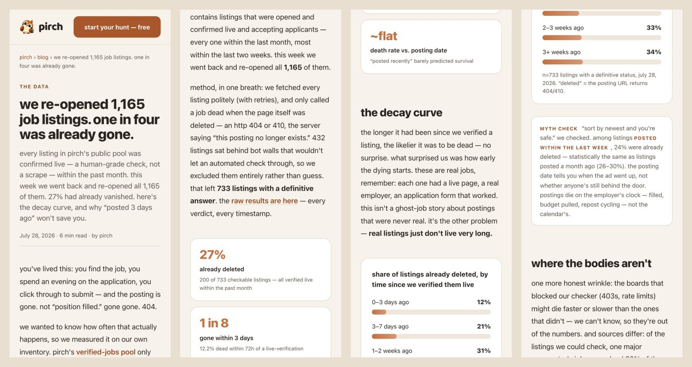
Every pirch post is assembled from blocks: big stat cards, bar charts that draw themselves as you scroll, side-by-side comparisons that turn into cards on a phone, myth checks, and a verdict. Every post ends with a numbered list of its sources.

The verdict carries an honest warning: pirch sells a job-search tool, so distrust this paragraph, the rest is sourced. And there's a hard rule about honesty: no post claims we tested something we didn't.

The strongest post is original research. We re-opened 1,165 job listings that had all been confirmed live within the month. Of the 733 that gave a clear answer, 27% were already gone, and 1 in 8 died within three days. The raw data is published with the post.

The study on a phone: stat cards, the decay chart, a myth check.
tab covers

Art that moves, in a style that never repeats

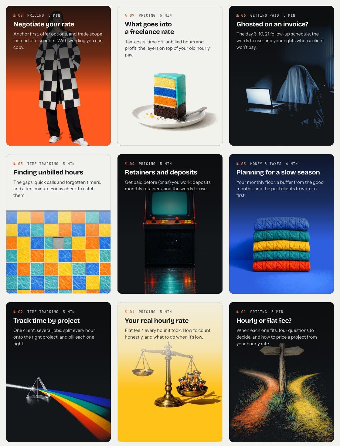
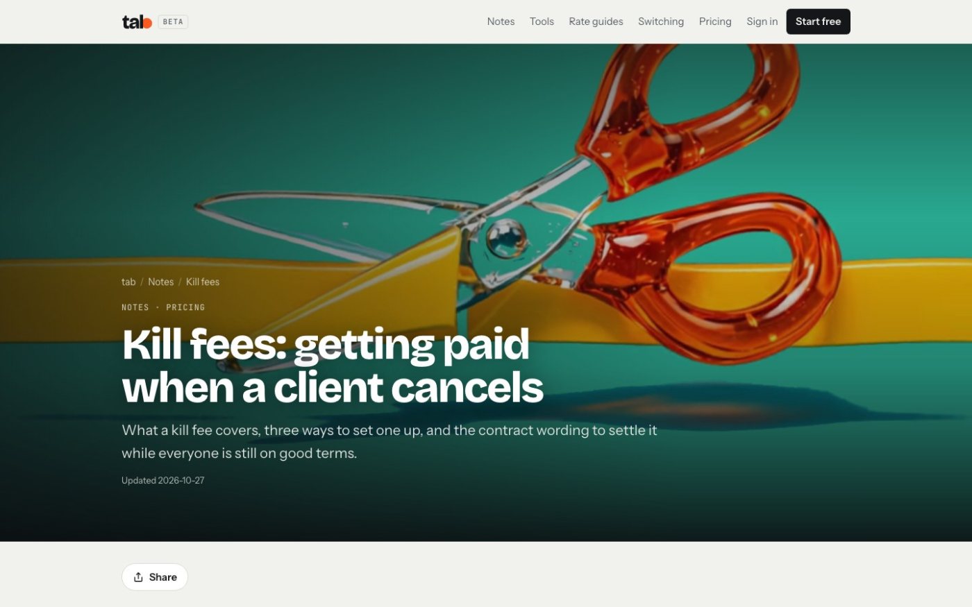
tab's notes are practical writing for freelancers: late fees, kill fees, raising your rates. The subject is dry, so the art isn't. A layered cake for what goes into a rate. A ghost at a laptop for an unpaid invoice. A stack of knitted sweaters for planning a slow season.

The rule is that no two pieces share a medium or texture: glass, knitted wool, ceramic tile, light through a prism, brass. On a note page the art fills the screen and moves. The same piece runs as a social post, so every note and every post look like one family without looking like a series.

The notes index, live. On each note page the art fills the screen and moves slowly.
tab notes

Write the article first

Every tab post starts as a note, not as a poster. The writing comes first, 900 to 1,400 words, and every figure links to where it came from, with the date it was checked. The art comes after.

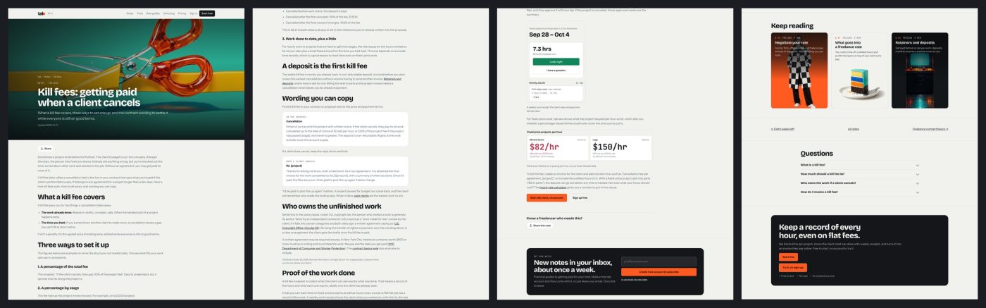
Inside a note, the product shows up the honest way: real tab screens with sample data, labelled as sample data. Then the note ends with a few short questions and answers, a share block, a subscribe box, three more notes to read and a link to the next in the series.

A whole note: the moving hero, wording you can copy, real tab screens, questions, keep reading.
The system

One recipe, three voices

Underneath, all three blogs run the same way: pick a topic people are already searching for, read what already ranks, write the part those pages miss, make the cover, check it, publish, and give it a share card. Only the look and the voice change.

That's what lets three small brands keep publishing without any of them going stale.

tab notes57
TasteOS posts21
pirch posts10
Posts and notes written so far, by blog.
Looking back

What I'd tell another designer

Give the art a rule, not a mood. "Tastey in every scene," "one object, one bird at most," "never the same medium twice." A rule is what keeps post 50 looking like post 1 without looking the same.

And design the end of the post as carefully as the top. The cover gets someone to click. The bottom of the page decides whether they do anything next.

work like this

need a blog with a look people remember? let's talk.

you work with me directly, from the first question to the last detail. tell me what you're making and where it's stuck.

next story
Yardwhite-label websites for manufactured-home communities, born from the Bild work.
→