Case study · Brady UX

1st90

Three years designing the app and web app behind 1st90, a behavior-change platform that turns company strategy into five-minute daily habits.

Client
1st90
Role
Product design, mobile + web
Product lead
Mike Heslin, founder
Years
May 2023 – May 2026
Platforms
iOS · Android · Web
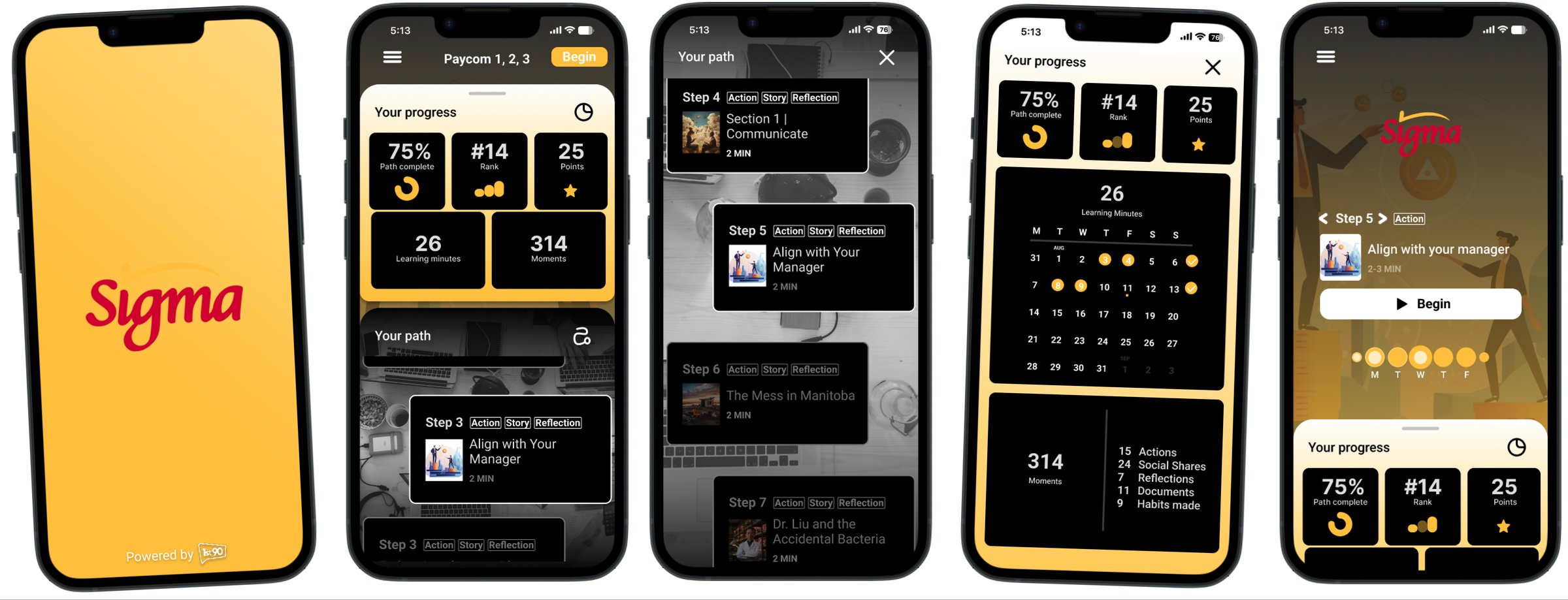
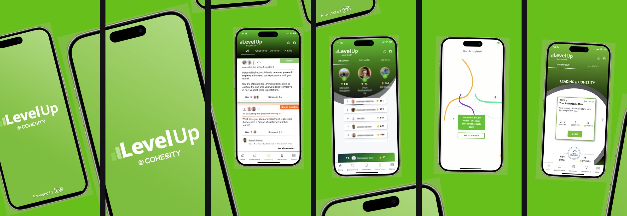
A row of 1st90 phone screens in a customer's colours
The 1st90 app, dressed for one of its enterprise customers. Every company gets its own name, colours and splash on top of the same product.
3years on the product
19Figma files
2,022screens designed
1,808components built
The product

Five minutes a day, for ninety days

1st90 is an enterprise behavior-change platform. Instead of pulling people off the floor for a training day, it gives them a short daily step inside the working day, then asks them to go do the thing at work and tell their peers how it went. A path runs about ninety days. That's the name.

It's bought by learning and operations leaders at large companies and used by everyone below them: new managers, frontline teams, onboarding groups.

The hard part of corporate learning isn't the content. It's turning what someone learned into a habit they keep at work after the path ends. Most of the product, and most of this work, was built around that.

1 · The step1 · The step
2 · The action2 · The action
3 · The share3 · The share
4 · The habit4 · The habit
5 · The return5 · The return
Fig. 1Final · Ready for devThe daily loop, in the final 2025 design. Read a short step, take one action at work, post your reflection for the group, turn it into a habit, and set the reminder that brings you back tomorrow.
2023Learning the machine

Starting inside a live product

1st90 already had real users when I joined. The first year was spent inside the existing flows: rebuilding them honestly first, finding where people dropped out, then changing one thing at a time.

None of this was designed alone. Mike Heslin, 1st90's founder, set the direction. He knew what he wanted the product to do, walked me through it piece by piece, and gave feedback round after round until each screen was what he was after. I designed it; he shaped what it needed to be.

The community feed

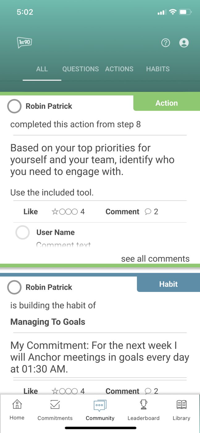
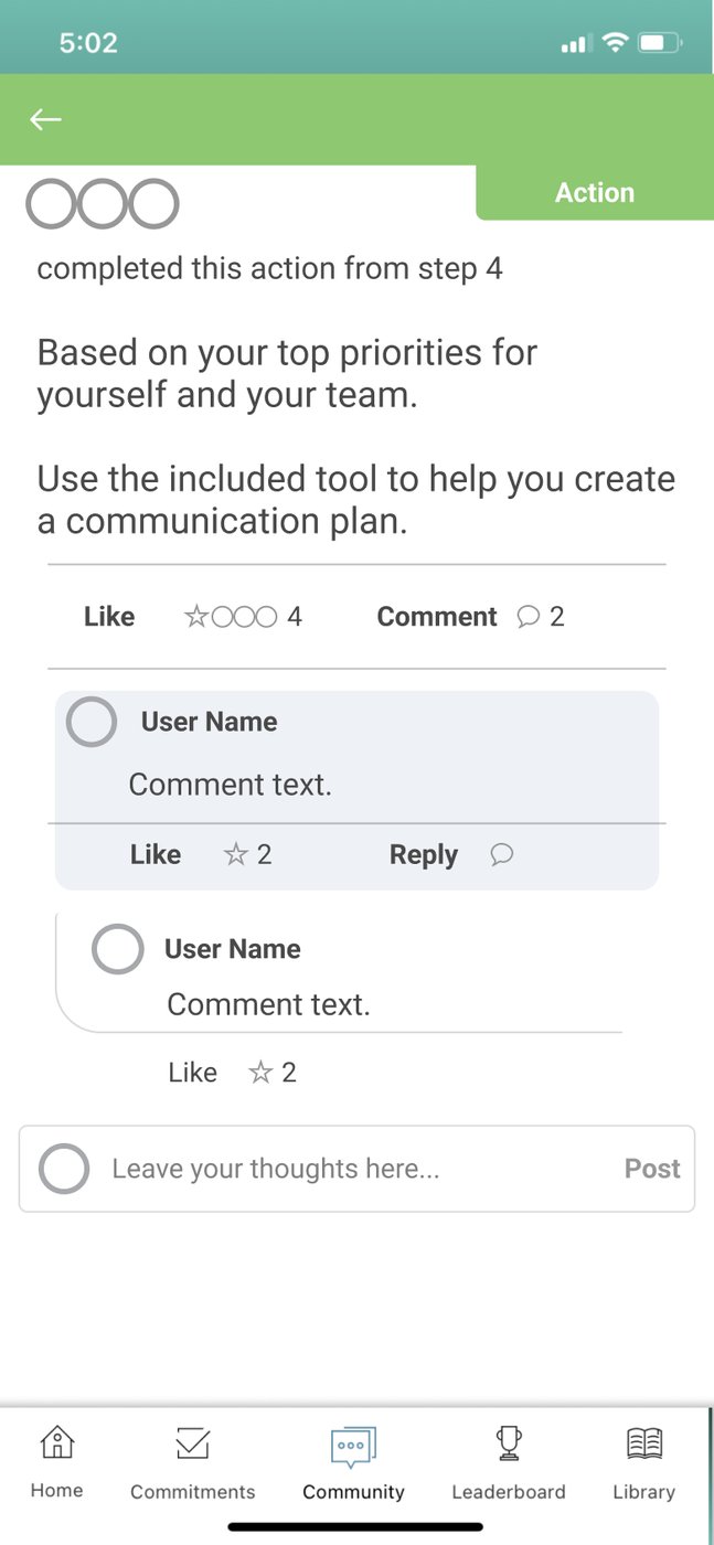
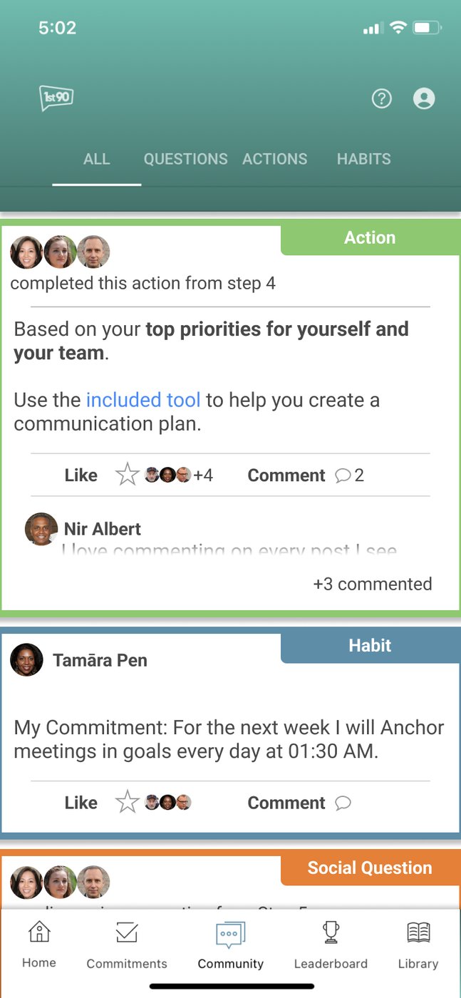
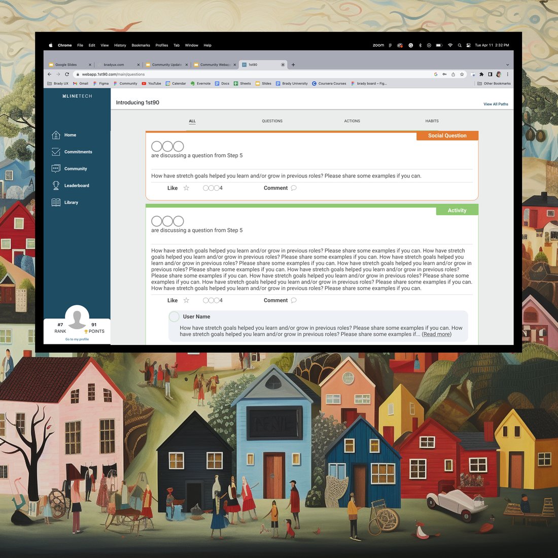
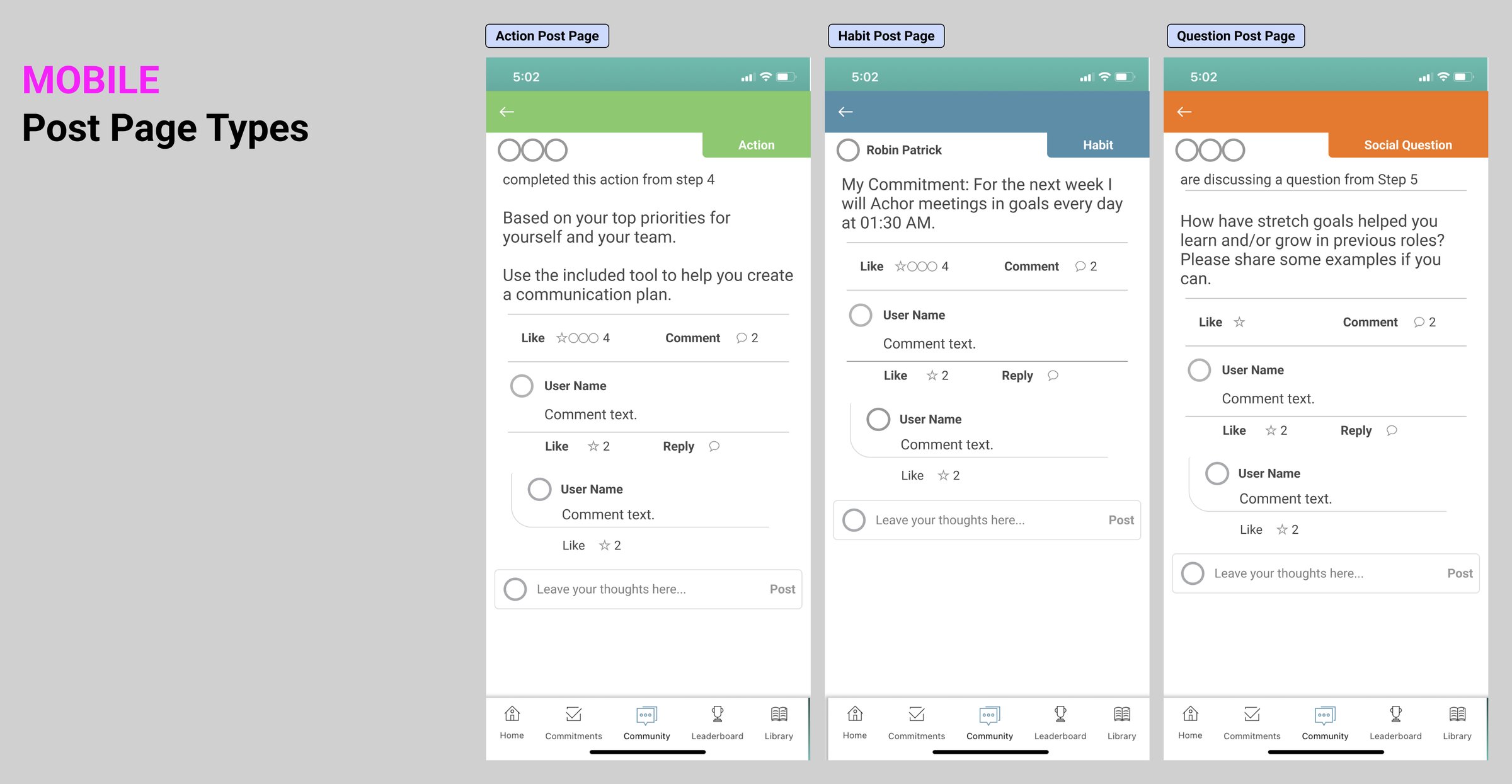
The feed is where people post what happened when they tried the action at work. It's accountability, not entertainment. But every post looked the same: a completed action, a habit someone committed to and an answer to a question all came in as identical grey cards, so the feed read as noise.

FeedFeed
PostPost
ReplyingReplying
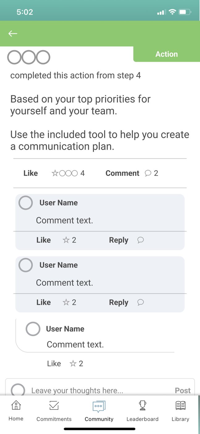
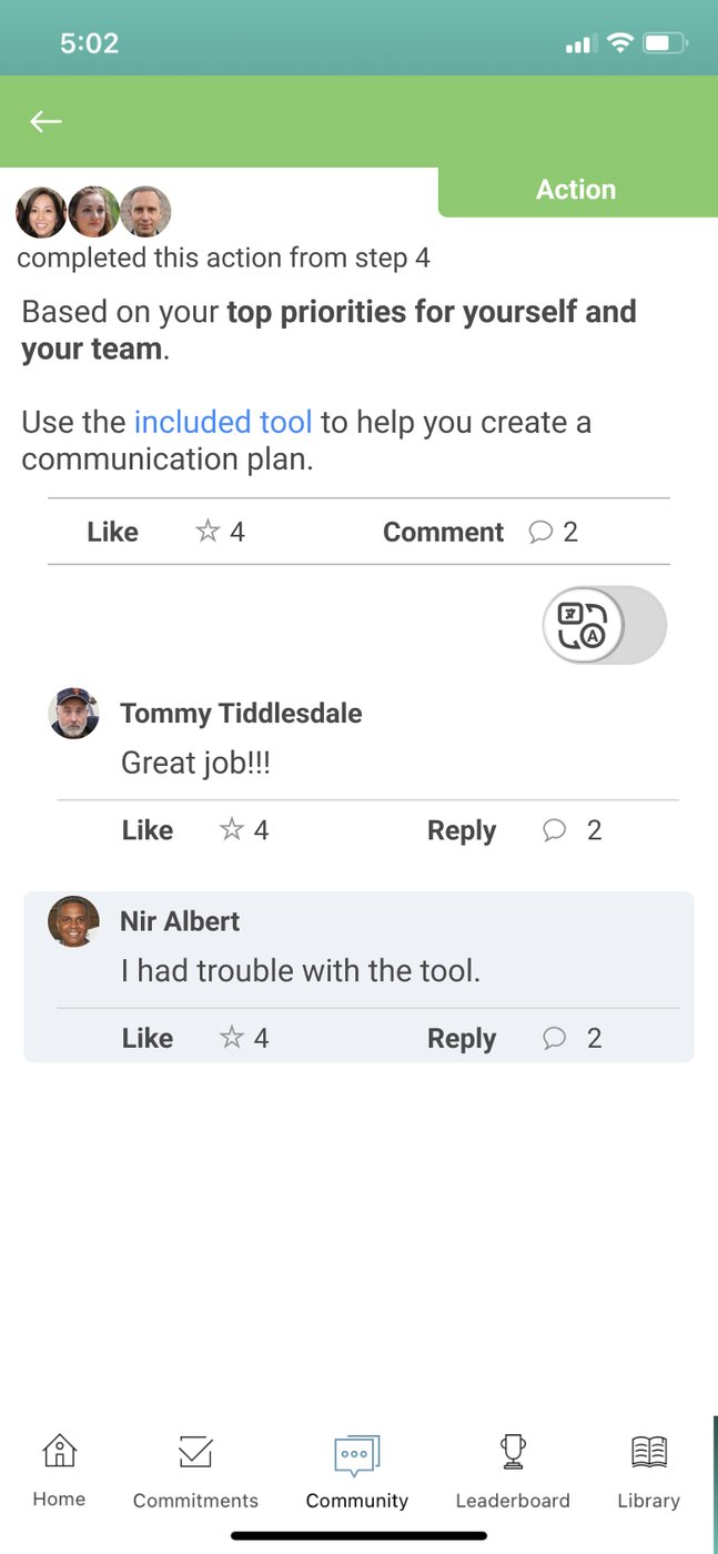
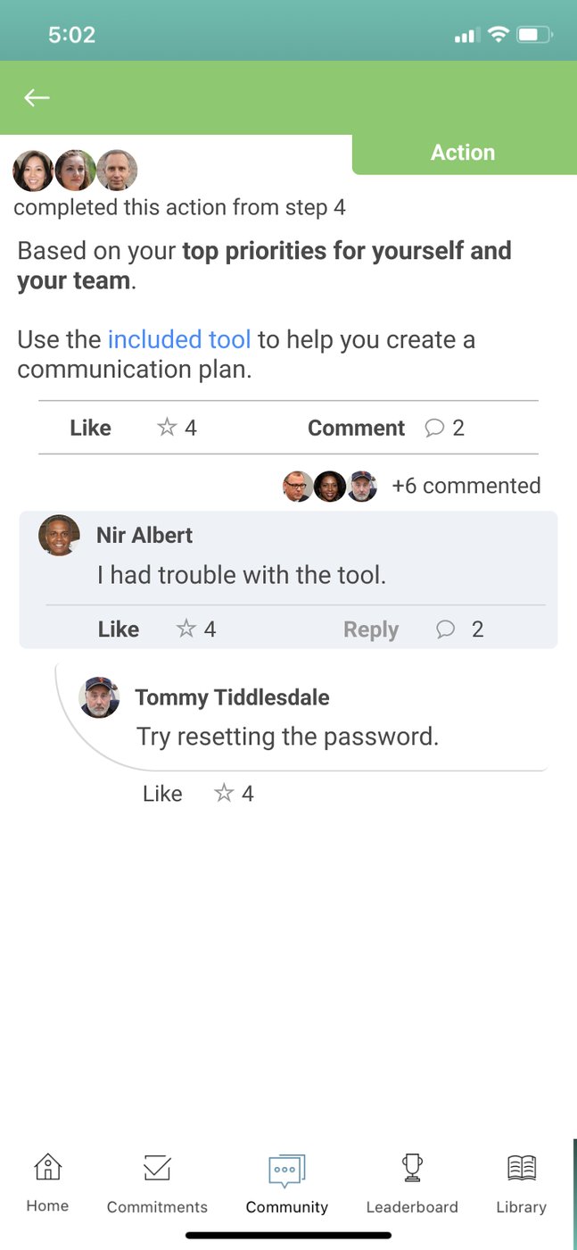
Fig. 2First pass in low fidelity: the feed, a single post with its thread, and the comment keyboard.

The fix was to give each post type its own colour and label (Action, Habit, Social Question) so the feed scans as proof that a group is doing the work. Then I designed the comment and reply system end to end: threading, indent rules, the keyboard overlay and the success state.

Labelled post typesLabelled post types
Comment postedComment posted
Reply threadedReply threaded
Fig. 3Final · 2023 handoffThe feed as handed to engineering in 2023. Each post type has its own colour band, and the reply flow covers every state between typing and sent.
The same feed on the web app, built from the same components, so desktop stopped being the second-class version.
Fig. 4The same feed on the web app, built from the same components, so desktop stopped being the second-class version.
A spec board for engineering: every post type, side by side.
Fig. 5A spec board for engineering: every post type, side by side.

The end of a step

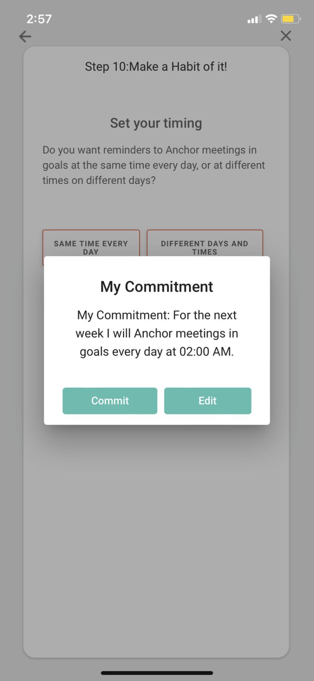
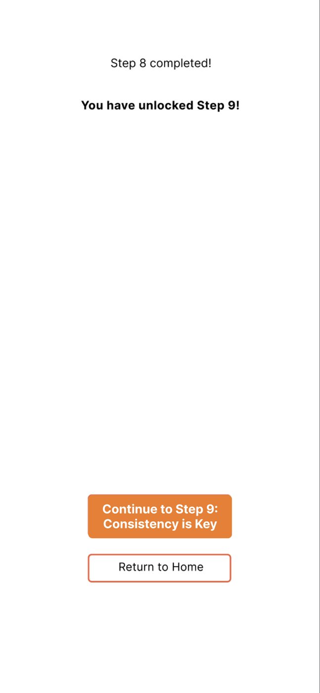
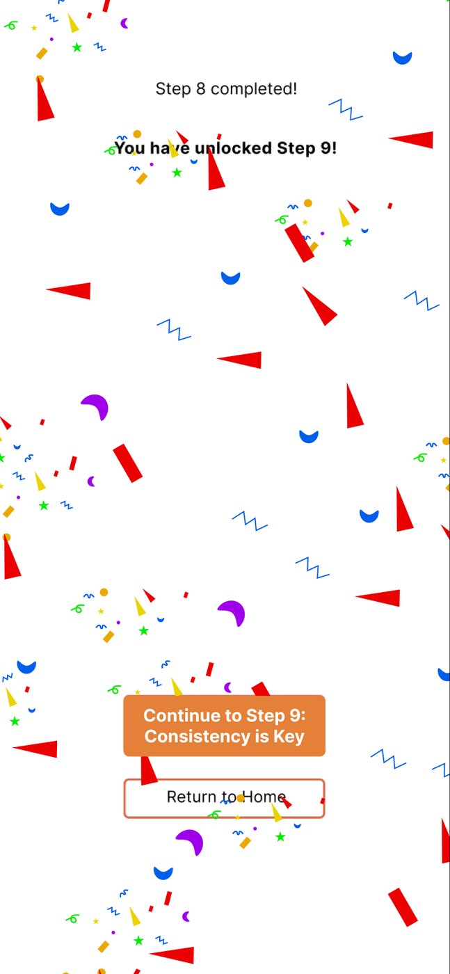
Finishing a step is the moment someone is most invested, and the app did almost nothing with it. I designed a short sequence: confirm the commitment, celebrate, and show the next step unlocking, so tomorrow feels like an open door instead of a reminder. It was one of the biggest explorations in the files, with 129 artboards on that page alone.
CommitCommit
Next step unlockedNext step unlocked
CelebrateCelebrate
Fig. 6The 2023 design: lock in the commitment, then celebrate and open the next step.

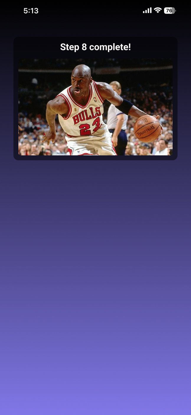
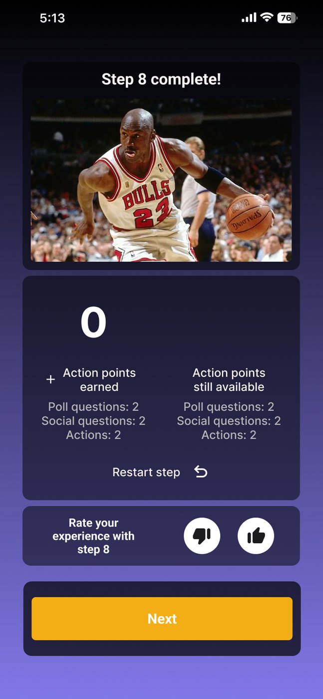
By 2025 the screen had moved on: step complete, the action points you earned and what's still available, and a quick thumbs up or down on the step.

Step completeStep complete
Points and ratingPoints and rating
Fig. 7In the app, mid-2025End of step as it stood in the app by mid-2025, captured in the streaks file before that work began.

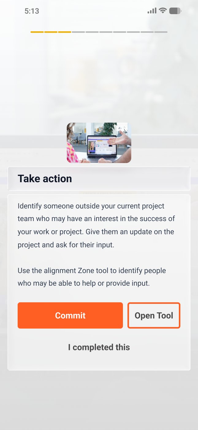
Open Tool and reflection

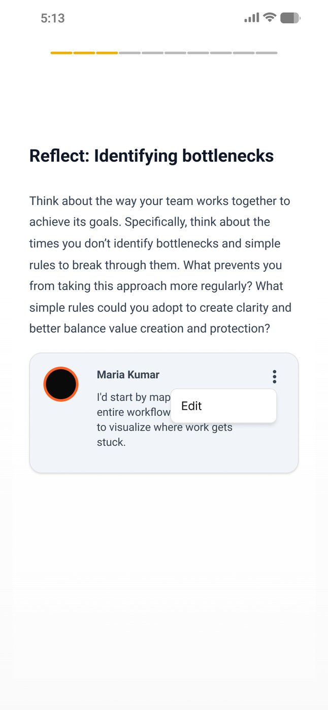
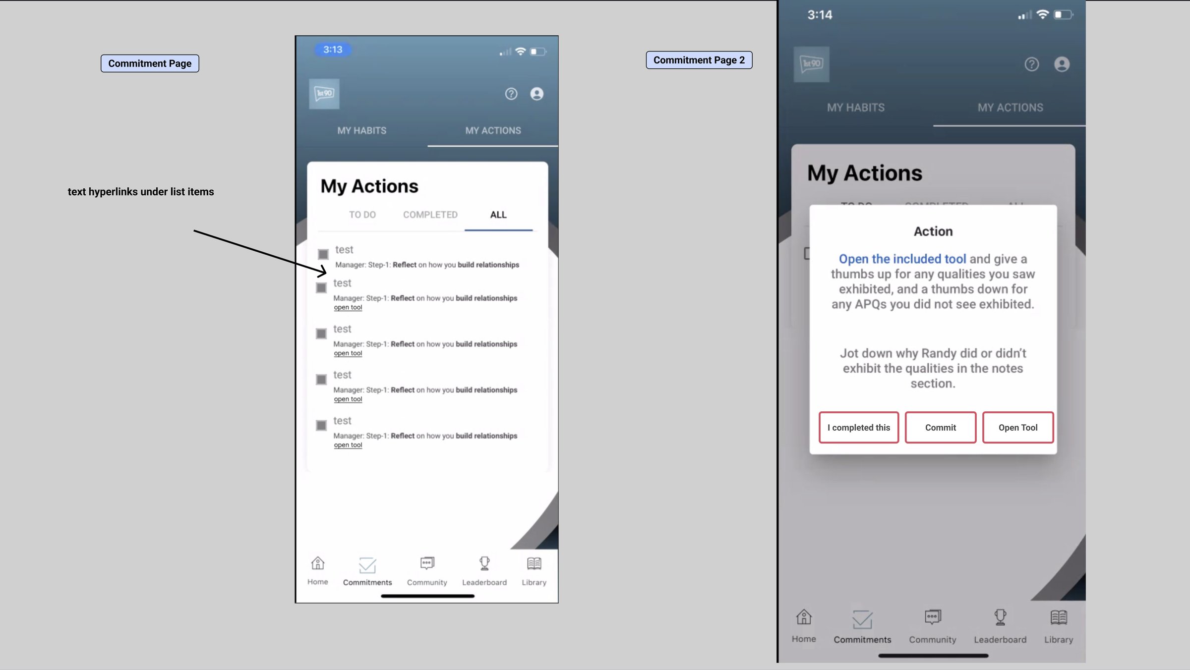
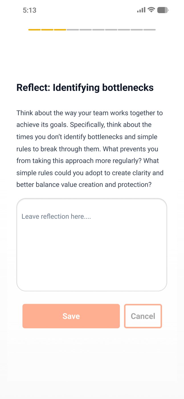
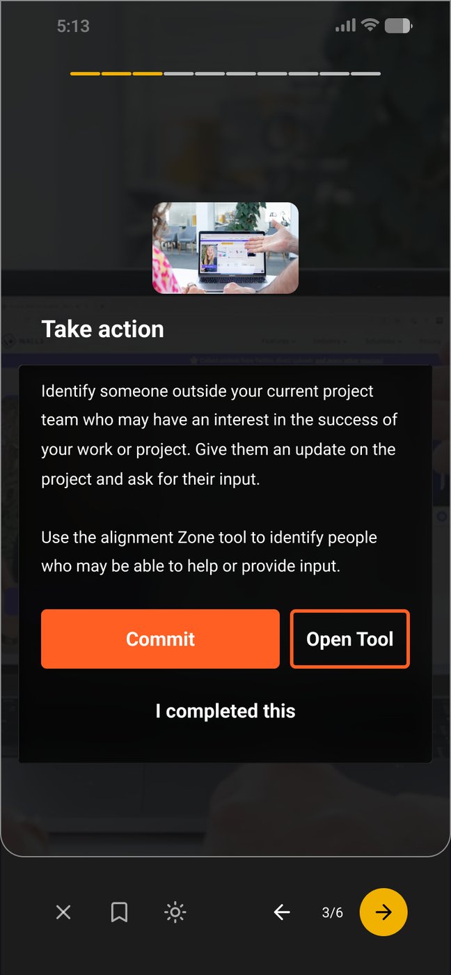
The action half of the product leans on tools like checklists, commitment builders and to-do lists. They opened from different places, each with its own layout and its own way of closing, so I pulled them into one container with variants. Reflection got the same treatment: one input that starts private, covering the unglamorous states (empty, typing, returned-to), because those are where a flow actually breaks.

Open Tool, worked out against captures of the live app so the redesign was measured against what actually shipped.
Fig. 8Open Tool, worked out against captures of the live app so the redesign was measured against what actually shipped.

A real web app

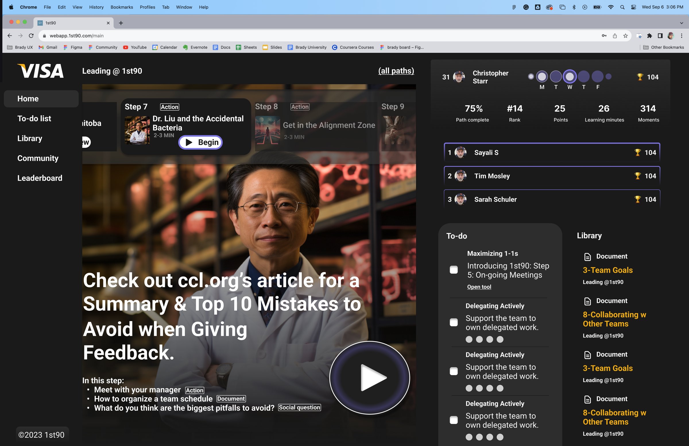
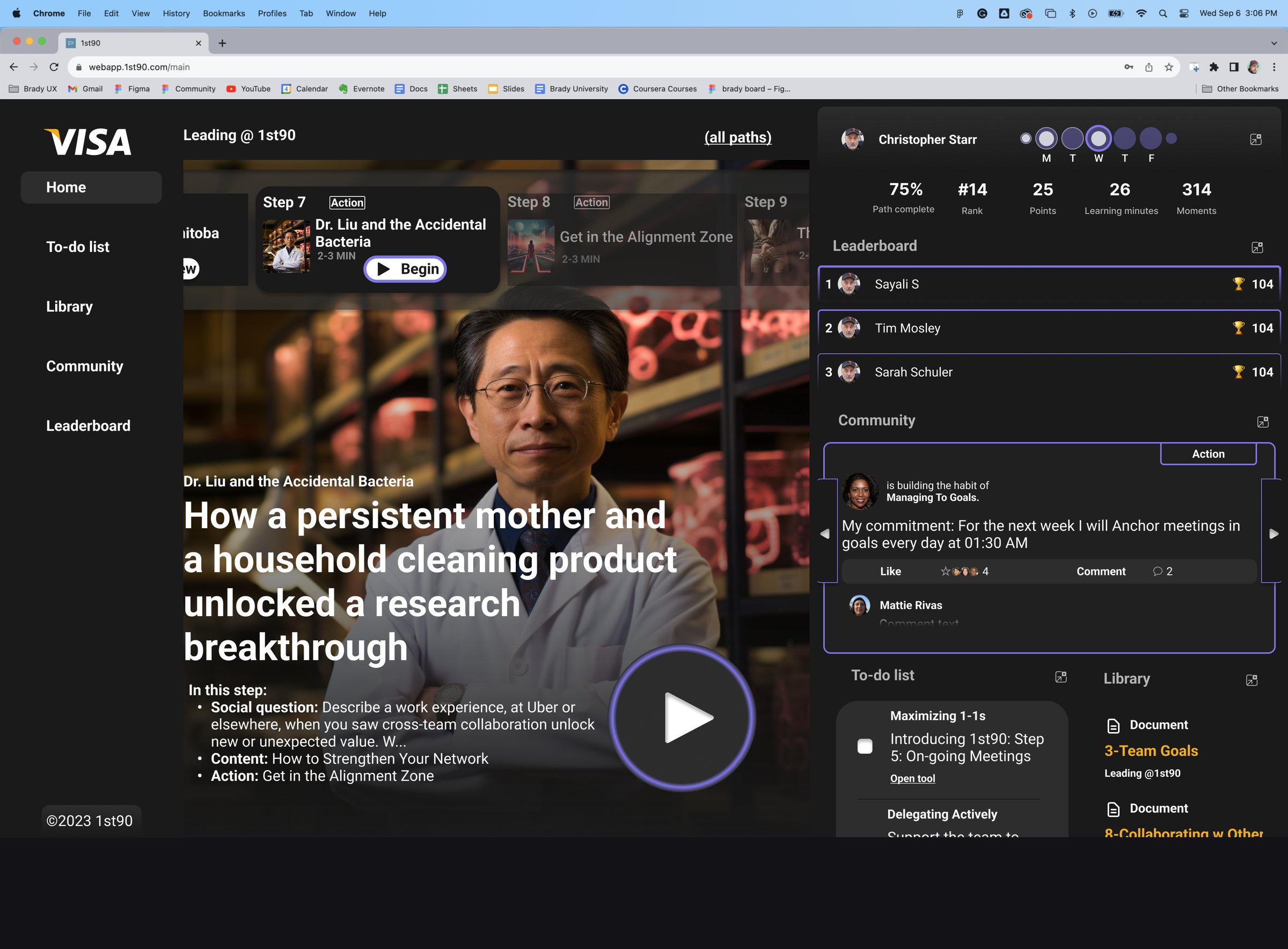
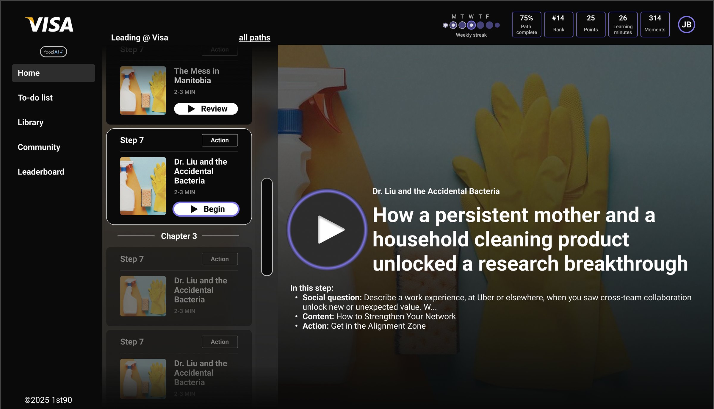
1st90 was a phone app with a website attached, and desktop kept getting a squeezed-down mobile layout. I designed a true web app home: the current step front and centre, with the path, progress, to-do list and community around it in a layout that uses the width. A dark treatment came in alongside the light one. That page alone holds 112 artboards.

The first true desktop home: today's step as a big video card, with progress, leaderboard and to-do list in the right column.
Fig. 9The first true desktop home: today's step as a big video card, with progress, leaderboard and to-do list in the right column.
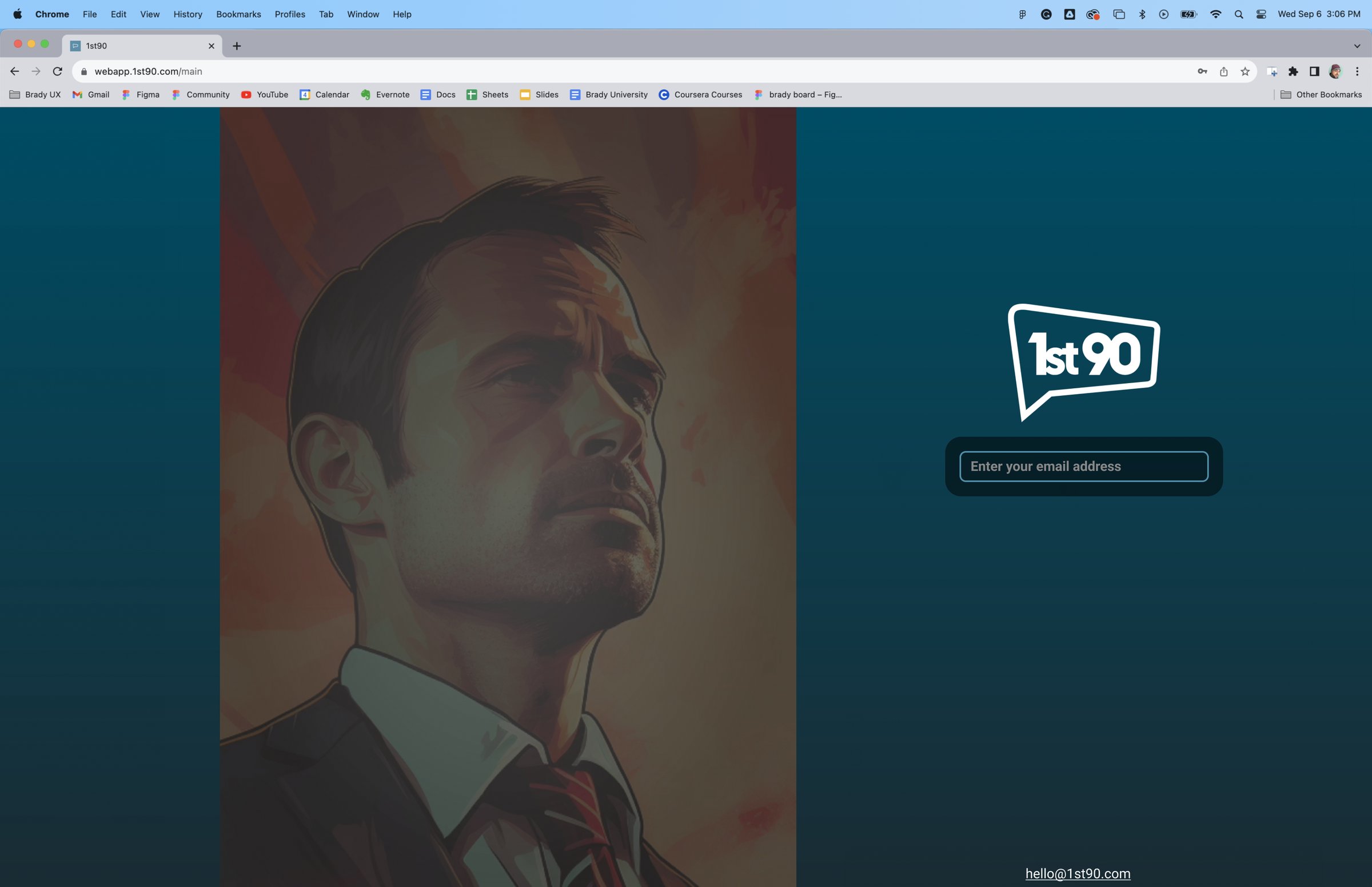
The web sign-in, in the darker visual language the product moved toward.
Fig. 10The web sign-in, in the darker visual language the product moved toward.
2024Making it a system

From screens to a system

In year two the app stopped being a pile of screens and became a system: one component library behind the mobile app and the web app, a dark identity, a white-label model for every customer, and the product's first AI feature.

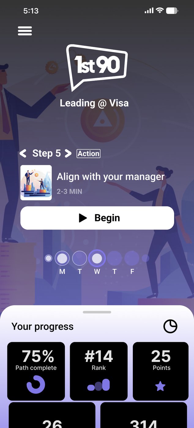
A home screen that tells you how you're doing

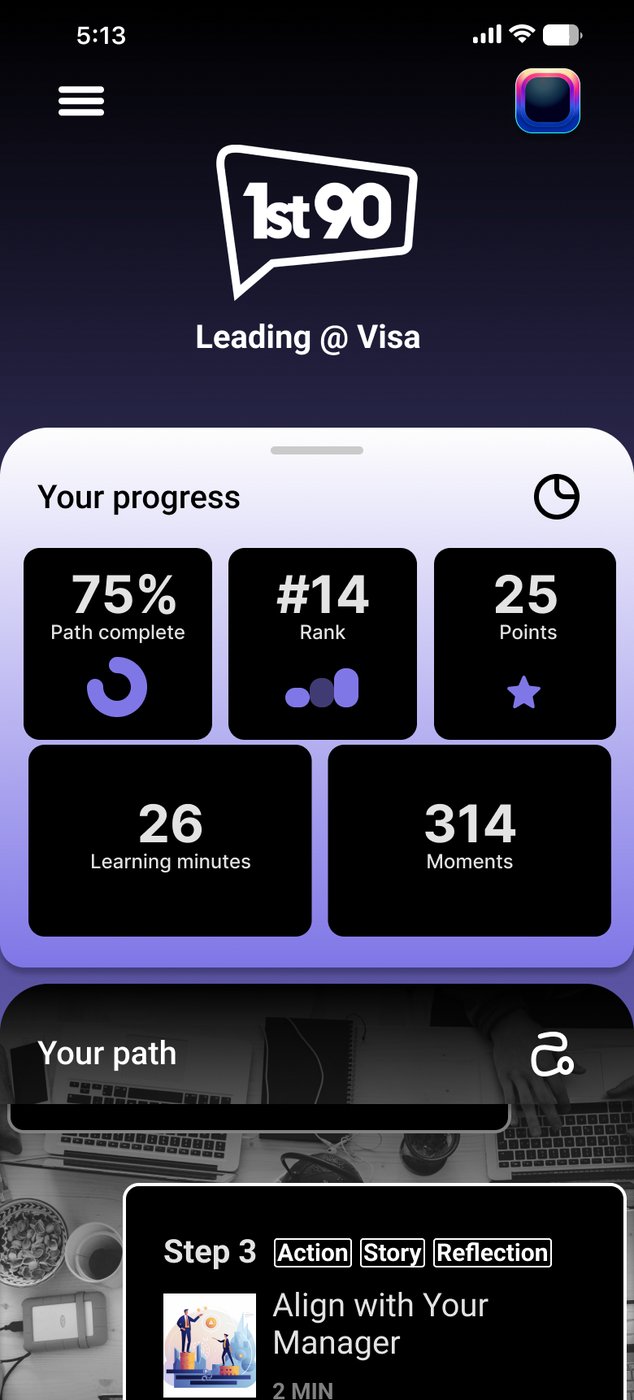
Home had been a launcher. It told you almost nothing about whether you were winning. The redesign made the current step the centre of the screen, tagged with what's inside it (Action, Story, Reflection) and how long it takes, and added a progress panel underneath with path complete, rank, points, learning minutes and moments.

HomeHome
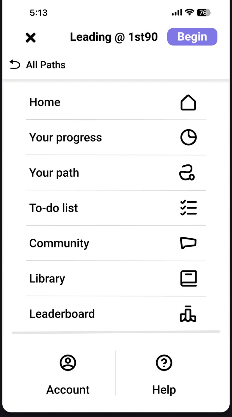
Menu, darkMenu, dark
Menu, lightMenu, light
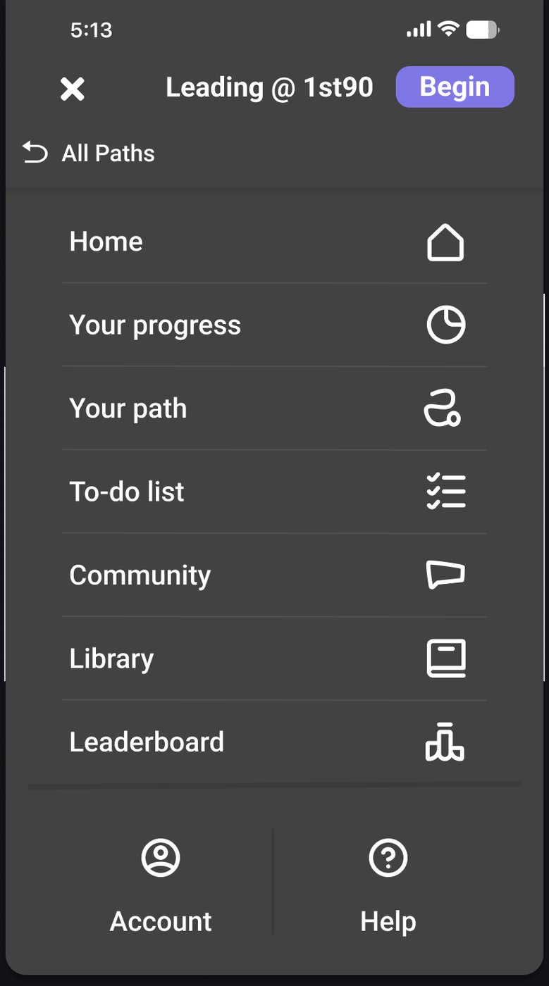
Fig. 11The 2024 home: the next step up top, your progress underneath. The menu was designed for both light and dark.
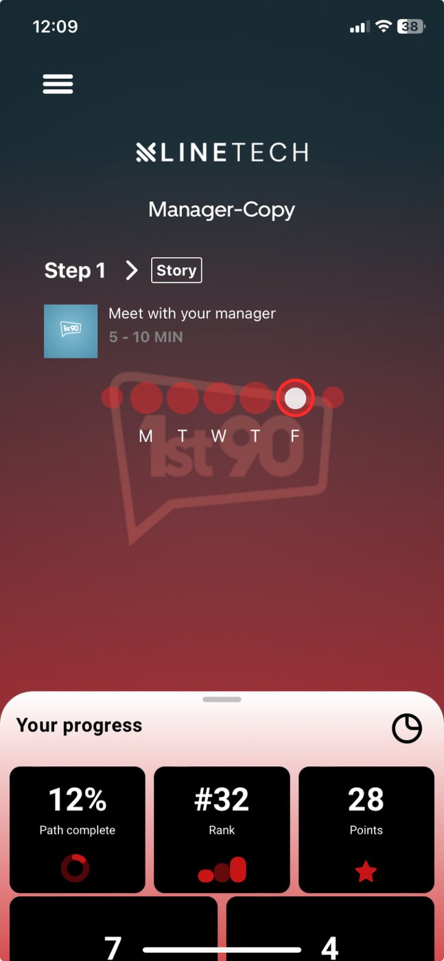
Home, liveHome, live
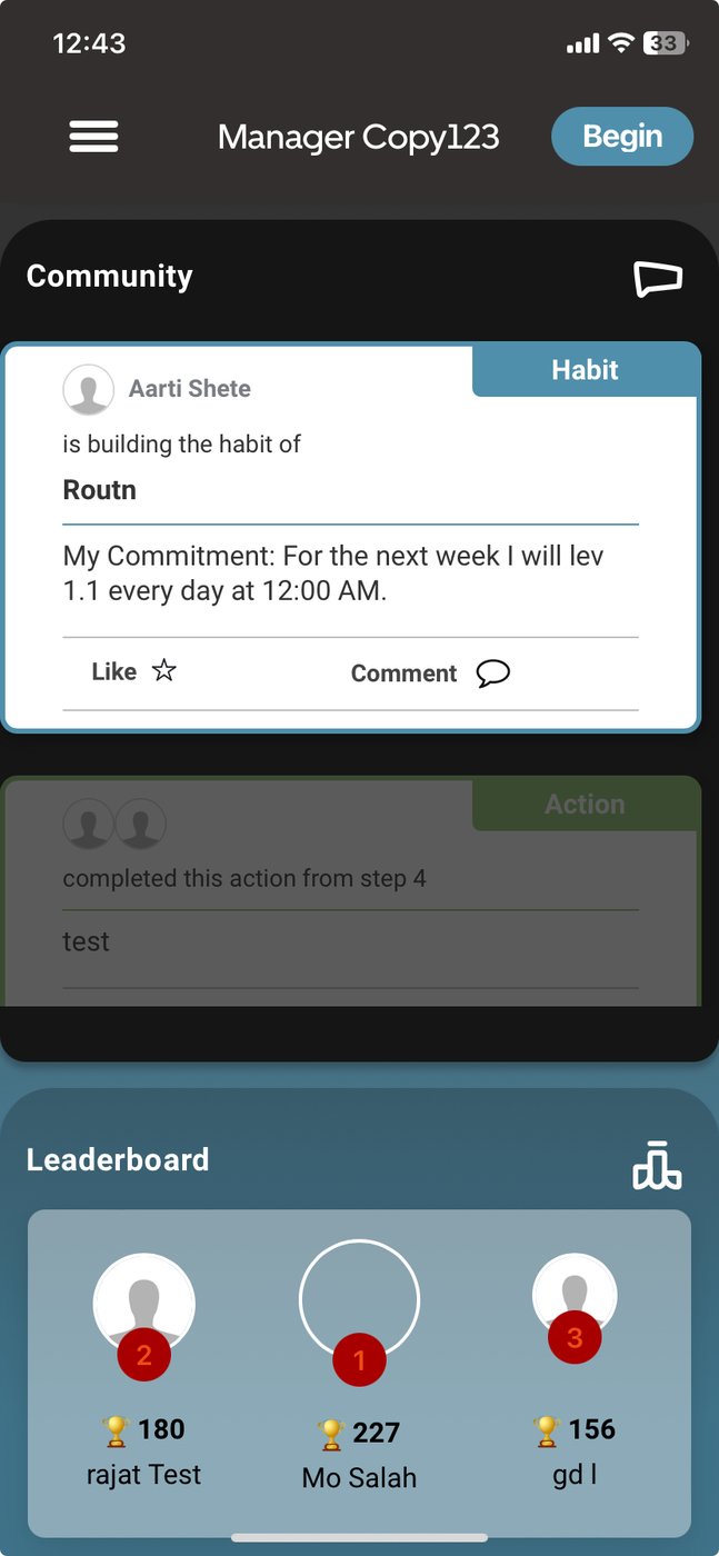
Community, liveCommunity, live
Fig. 12Live app screenshotThe same design in the live app, from screenshots kept in the Home file. Different customer, same layout: progress up top, today's step, the weekday streak dots.

One app, many companies

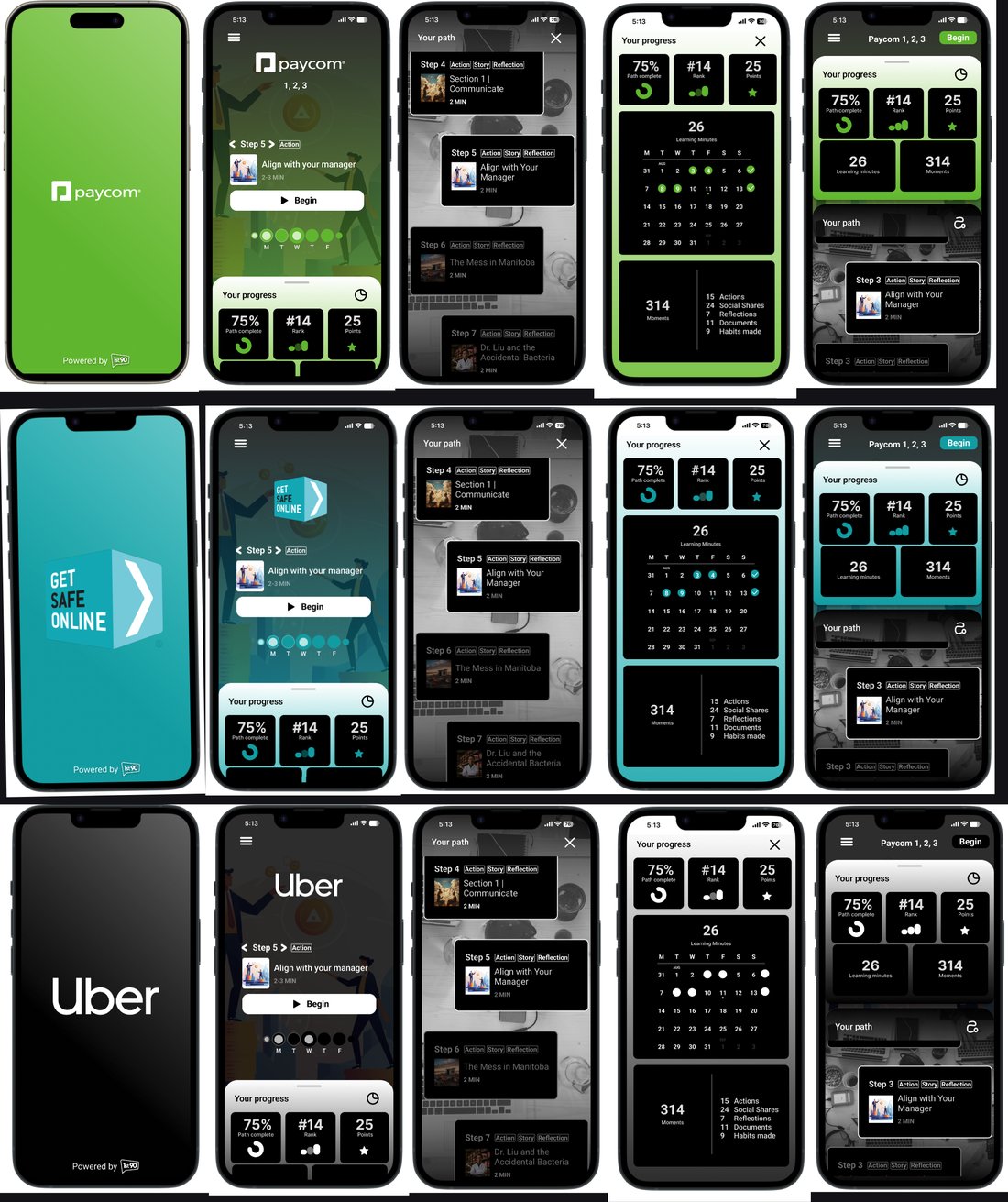
Every enterprise customer gets its own path name, logo and colours. That one constraint shaped the whole colour system: the palette had to stay small, because every new colour gets multiplied across every customer. I kept a dedicated file of versions so decisions were made against the full spread of customers, not one example.

The same screens, rebranded for several customers. The product doesn't change; the accent colour and splash do.
Fig. 13The same screens, rebranded for several customers. The product doesn't change; the accent colour and splash do.
A customer-branded launch set: splash, home, progress and path in one colour story.
Fig. 14A customer-branded launch set: splash, home, progress and path in one colour story.

The design system

By 2024 the same component lived in four files with four slightly different paddings. I pulled them into one library with a maintained prototype page, and moved the type from Roboto to Inter as the app modernised. The archive holds 1,808 component definitions. The system is the reason 2,000+ screens were possible at all.

Foozi, the AI concierge

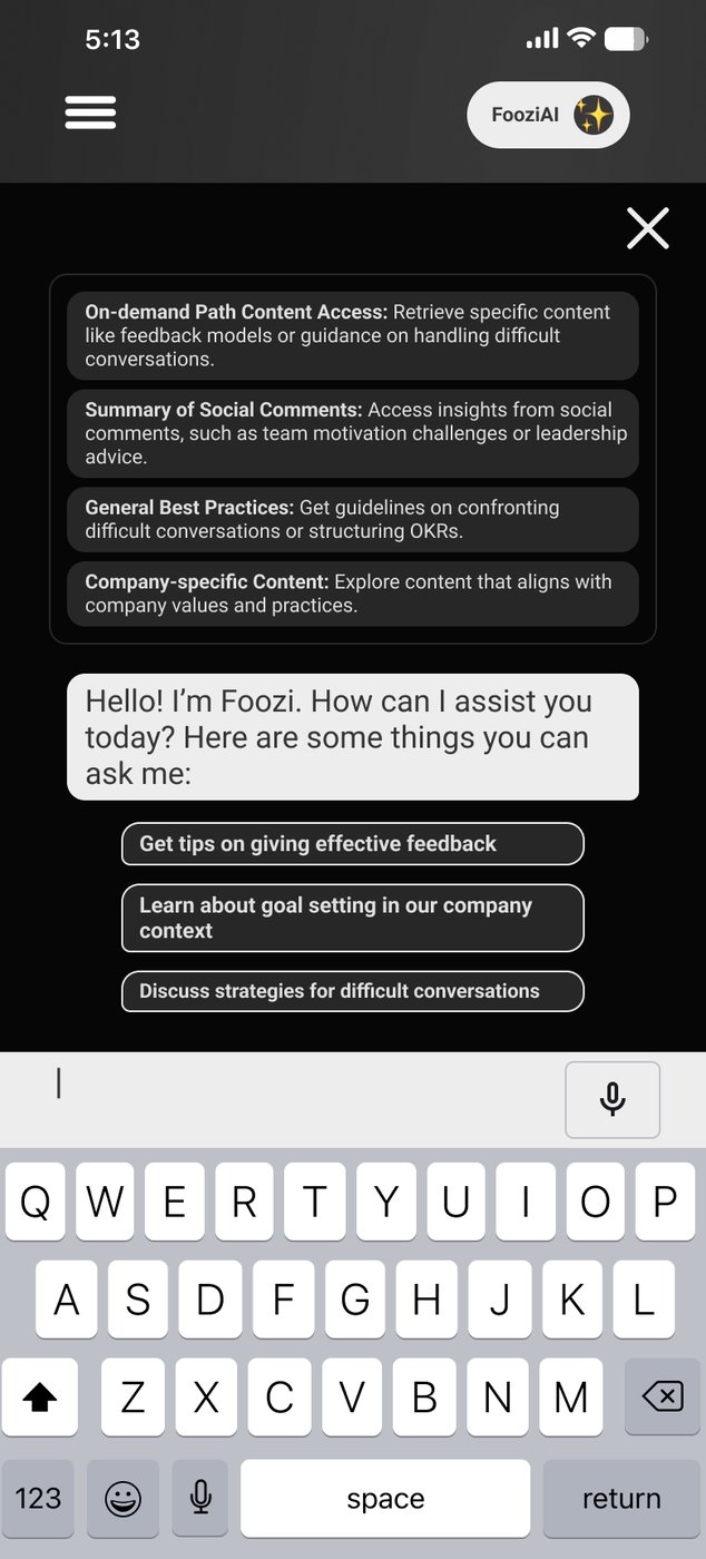
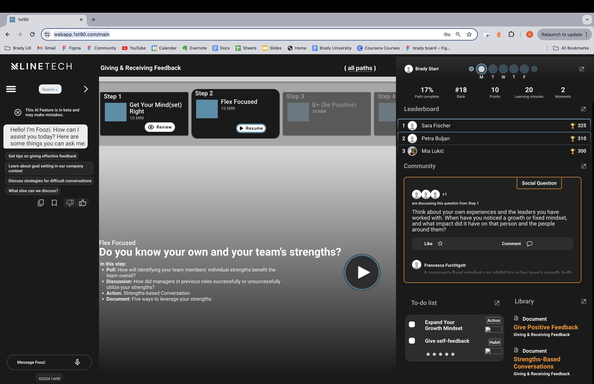
People forget what was said at the live event a path is reinforcing. The content was in the app, but you couldn't ask it anything. Foozi is the assistant that answers from it. I designed its chat on mobile and web from one set of components, with the typing, answering and returned states built as components so engineering could drive them from one place.
Foozi's character art.
Fig. 15Foozi's character art.
Foozi on mobileFoozi on mobile
Fig. 16Foozi opens with suggested questions, so nobody faces a blank box.
Foozi on the web app, sitting beside the step instead of replacing it.
Fig. 17Foozi on the web app, sitting beside the step instead of replacing it.
2025Making it stick

The motivation year

Year three was about getting people to come back. Streaks, badges, a rebuilt daily step, a proper habit flow, and a builder that let 1st90's own team assemble paths without a designer.

Streaks

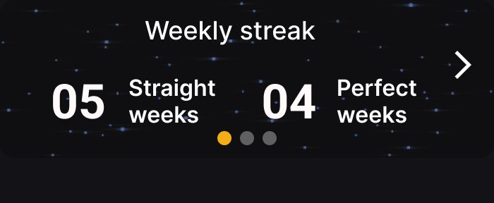
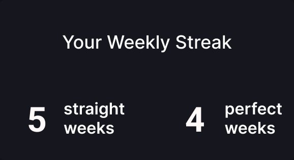
The app had no reason to open on a day you weren't feeling it. Streaks were the answer, but a streak that shames you is worse than no streak at all. So instead of a fragile day counter that resets the moment you miss, I settled on two durable numbers: straight weeks and perfect weeks. Every day state got drawn as a component (done, pending, missed, weekend complete, weekend incomplete, bonus).

The streak widget: straight weeks and perfect weeks, not a day count that breaks on a sick day.
Fig. 18The streak widget: straight weeks and perfect weeks, not a day count that breaks on a sick day.
The next stepThe next step
Weekly streak cardWeekly streak card
Fig. 19Two of the components that carry the streak around the app: the step card on home, and the weekly streak card.
Streaks on the web app home.
Fig. 20Streaks on the web app home.

In the live app the streak showed up as a row of weekday dots under today's step, the simplest version of the idea.

It went through mobile, web and an animated prototype, then I packaged a clean deliverable file for 1st90's designer and engineers. The streaks file holds 63 review comments, the most of any file in three years.

Weekday dots under the stepWeekday dots under the step
Fig. 21In the app, mid-2025Home in mid-2025: the streak as weekday dots under today's step.
The cover of the streaks deliverable file.
Fig. 22The cover of the streaks deliverable file.

Badges

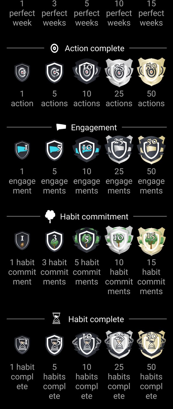
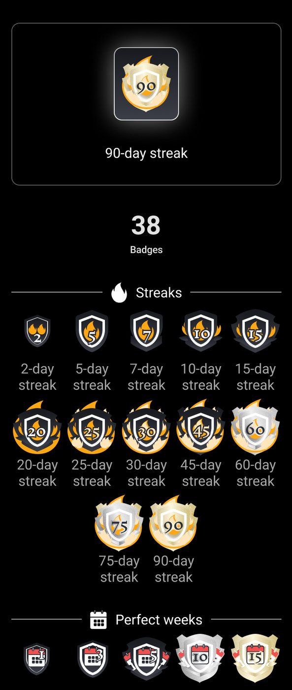
Rewards pile up badly. Add them one at a time and you end up with forty mismatched icons and no sense of progress. I designed the set as a system first: six families (streaks, perfect weeks, actions complete, engagements, habit commitments, habits complete), one shield shape across all 38 so they read as a collection, and a bronze, silver, gold ladder for difficulty. Each family has its own symbol so a badge is recognisable at 32 pixels.

The badges never made it into the product. 1st90 changed direction before they were pitched, so the set stayed in the design file. I'm including it because it's a finished system, and it shows how I'd approach rewards on any product.

Fig. 23All 38 badges, grouped by family. Designed, but never pitched or shipped: the product changed direction first.

The daily step, rebuilt

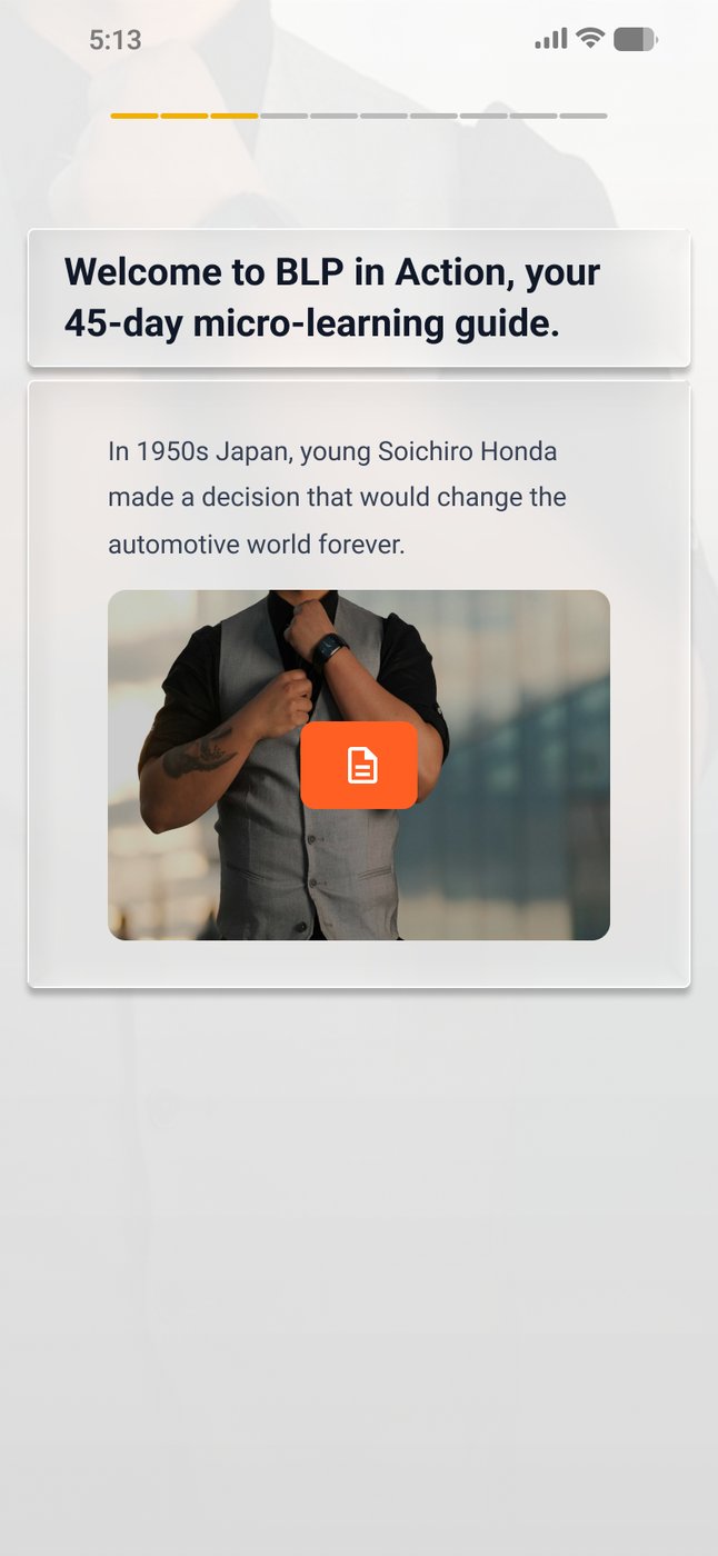
The in-step experience is the screen people use every single day, and it had collected years of additions. It worked, but it read as a stack of features instead of one experience. I rebuilt it in one pass across mobile, web and dark: lighter, higher contrast, Inter throughout, with the customer's accent colour as the only thing that changes per company.

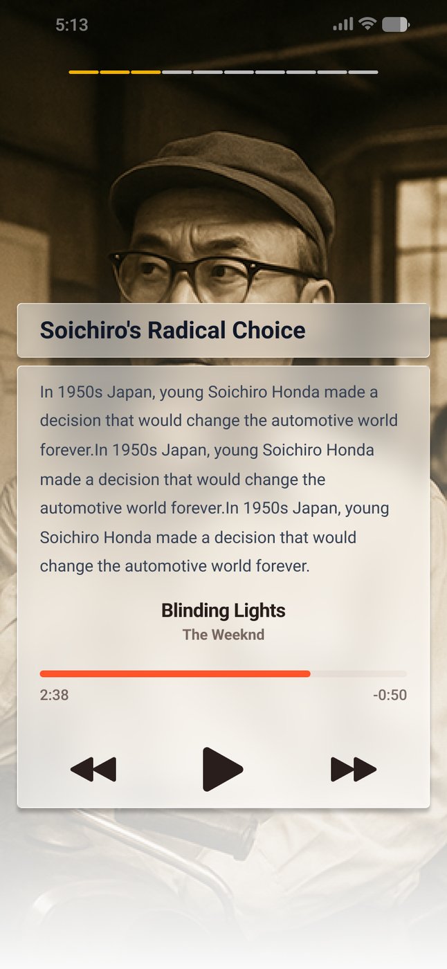
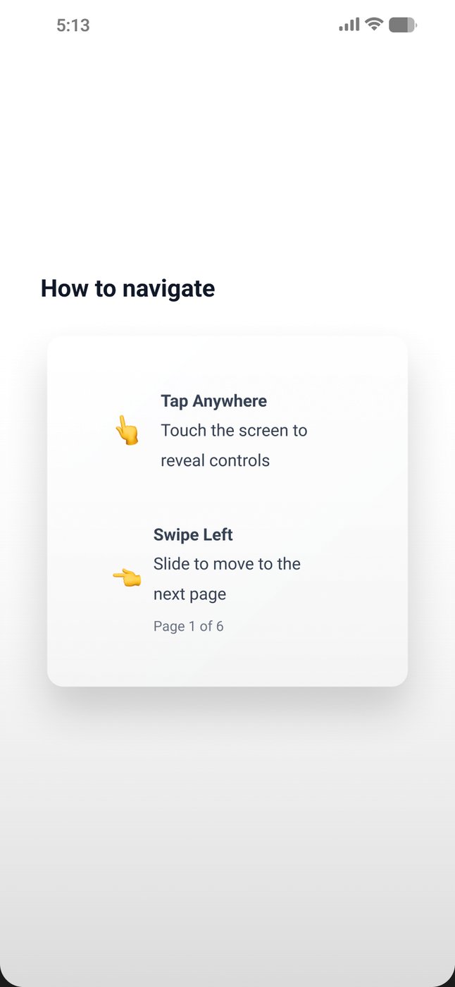
The biggest change in the final version: the controls get out of the way. The step fills the screen, you swipe to move on, and a tap brings the controls back.

How to navigateHow to navigate
A video stepA video step
A reflectionA reflection
Dark, controls showingDark, controls showing
Fig. 24Final · Ready for devThe final daily step, from the November 2025 handoff. Swipe to move on; tap anywhere to bring the controls back.

Social questions and polls

A question that just collects answers is a form. The value is seeing the group's answer next to yours. I designed the flow as answer, finalize, then reveal: once you commit, you see how others answered, and on polls the group's average lands on the same scale as your answer.

AnswerAnswer
Ready to shareReady to share
Join the discussionJoin the discussion
Poll, with the groupPoll, with the group
Fig. 25Final · Ready for devAnswer, share, then see the group. On a poll, your answer comes back with how everyone else answered.

Habits

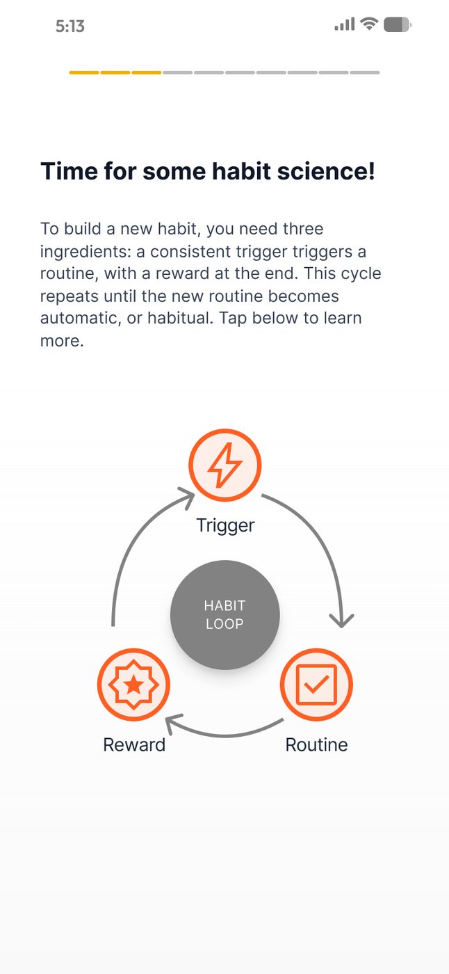
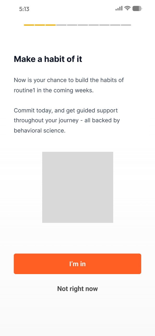
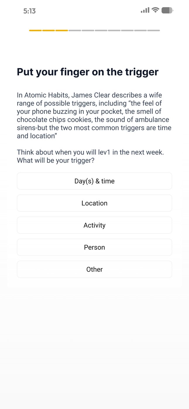
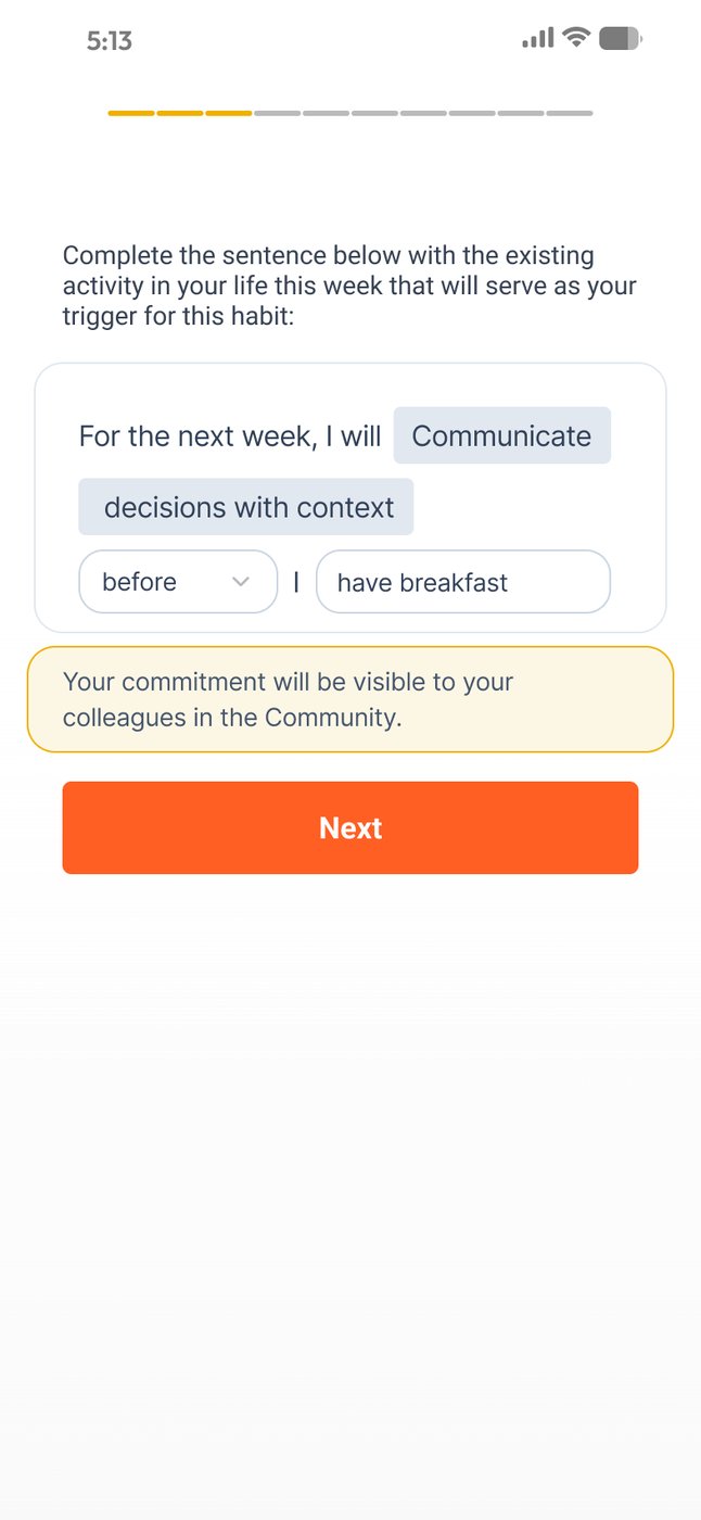
Building habits was the product's promise and its least designed surface: a commitment box with nothing around it. I designed an explicit opt-in with the behaviour model visible (trigger, routine, reward) and drew an icon for each stage, so the idea lands without a paragraph of copy.

Opt inOpt in
The habit loopThe habit loop
Pick a triggerPick a trigger
Say whenSay when
Fig. 26Final · Ready for devThe habit opt-in: say yes, learn the loop, pick a trigger, then write the commitment in your own words.
Habit queueHabit queue
Habit queue, darkHabit queue, dark
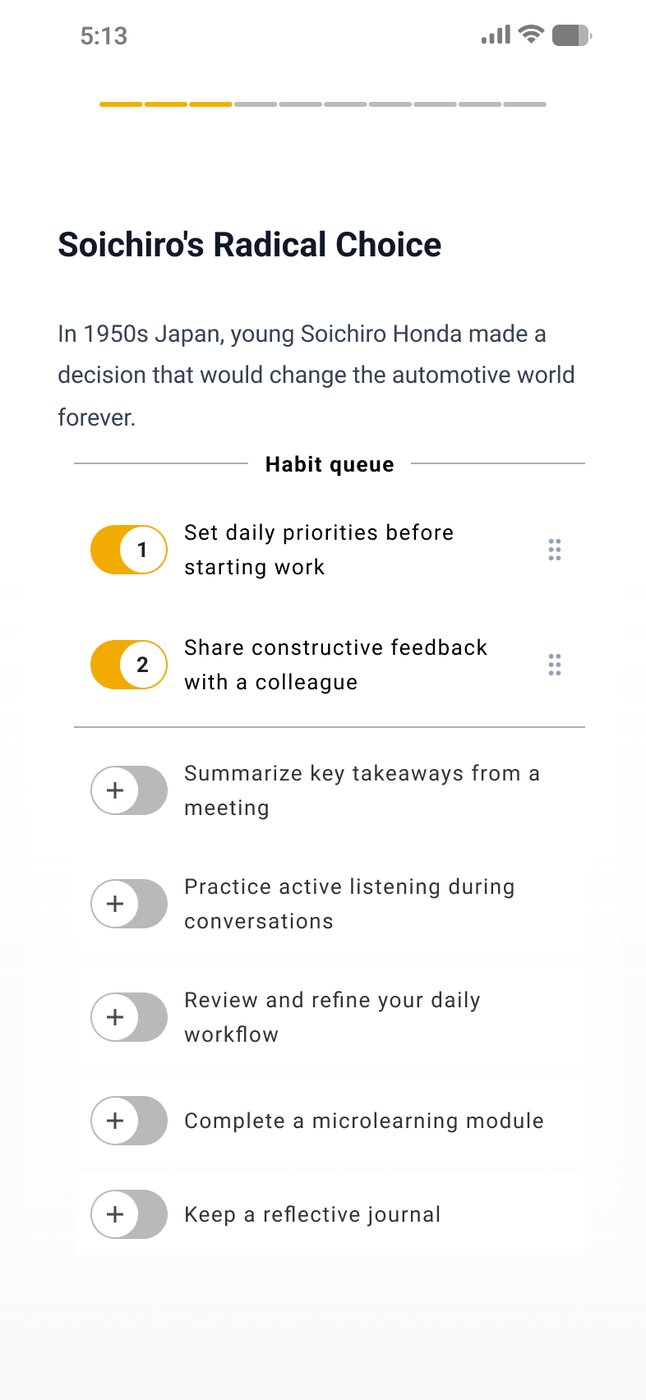
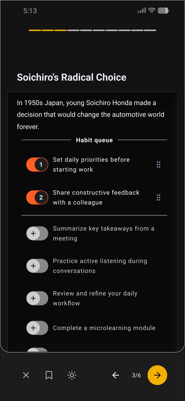
Fig. 27Final · Ready for devThe habit queue: switch on a few habits and work them one at a time, week by week.

The to-do list

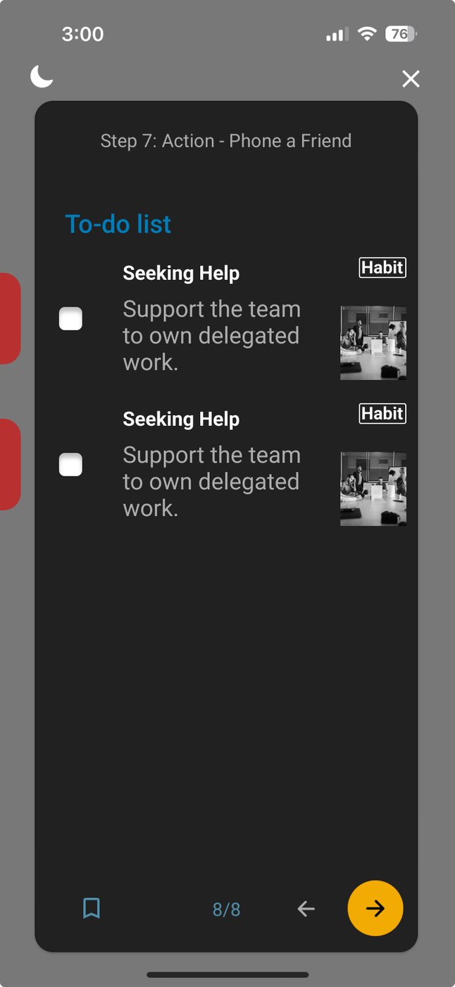
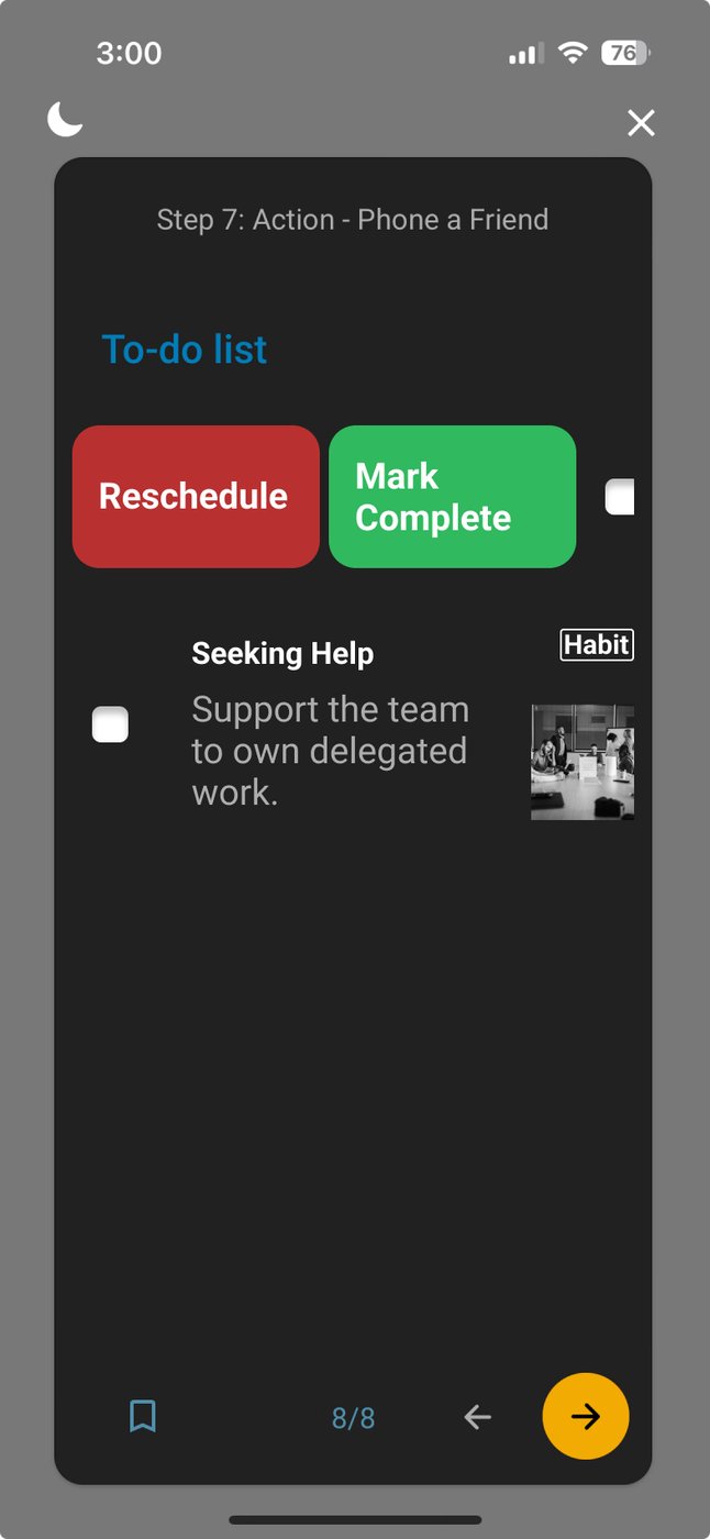
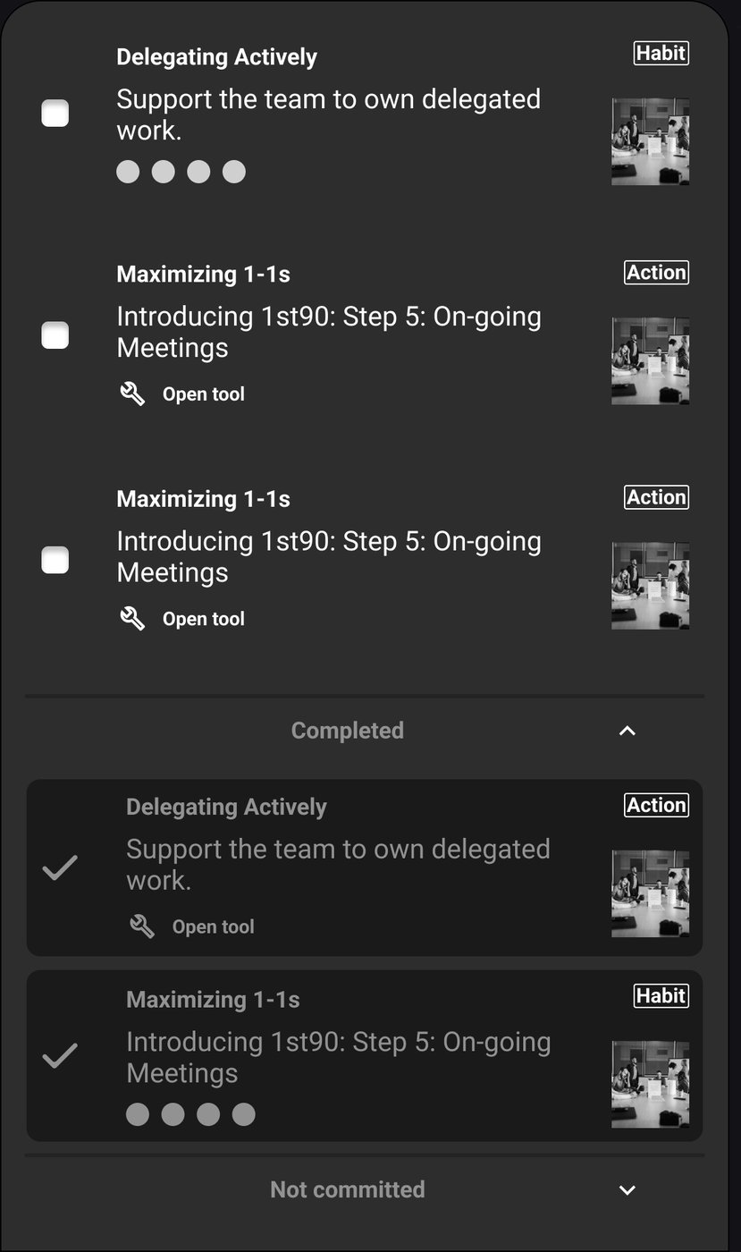
The to-do list collected the actions from every step, and it had become the place commitments went to be forgotten. I rebuilt the list, its states and its link back to the step each item came from, with a quick swipe to reschedule or mark complete.

To-do listTo-do list
Reschedule or completeReschedule or complete
Done and not committedDone and not committed
Fig. 28The to-do list: each item tagged Habit or Action, with reschedule and mark complete right on the item.

The learning path builder

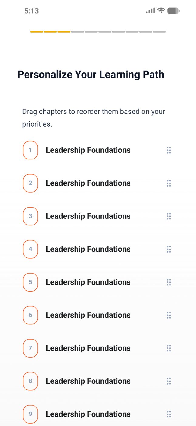
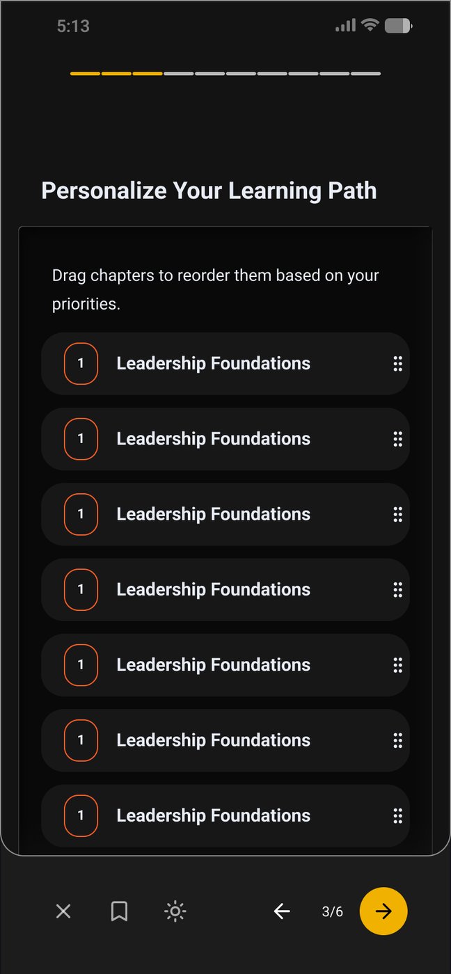
Every customer path used to be assembled by hand, which capped how fast 1st90 could grow. The personalized learning path builder lets a learner reorder topics by priority, with suggestions from Foozi, and lets 1st90's team build paths without a designer. This was design aimed at the business model, not just the screen.

Personalize, lightPersonalize, light
Personalize, darkPersonalize, dark
Fig. 29Final · Ready for devLearners drag topics into their own order. This step went into the final handoff in light and dark.

The web home catches up

The mobile home had moved on twice. The web home hadn't. The 2025 pass brought it in line with the mobile progress and path model, in the new visual language.

Before: the web home going into 2025, still on the earlier layout.
Fig. 30Before: the web home going into 2025, still on the earlier layout.
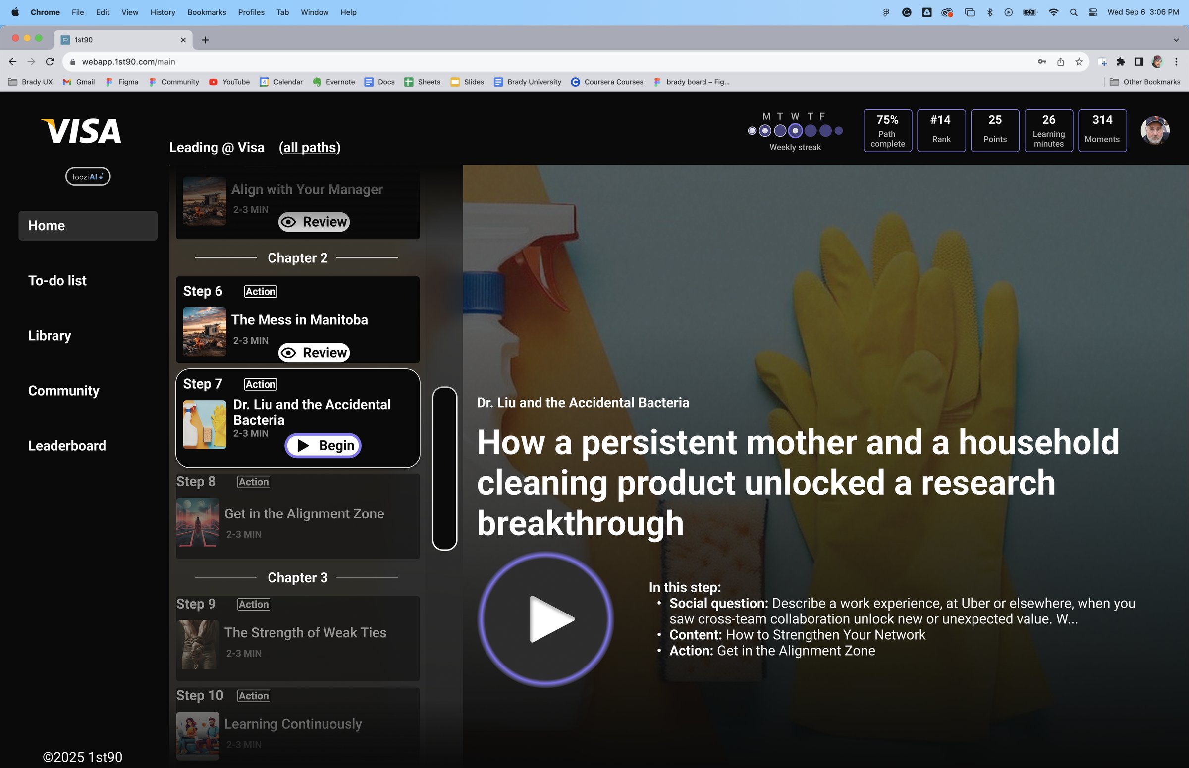
After: the path by chapter down the side, today's step large beside it, and progress across the top.
Fig. 31After: the path by chapter down the side, today's step large beside it, and progress across the top.
2026Handing it off

Everything written down

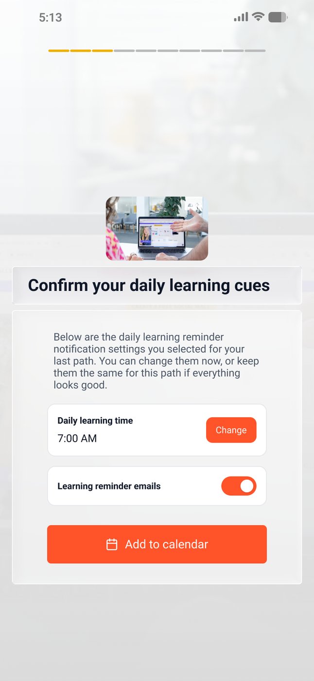
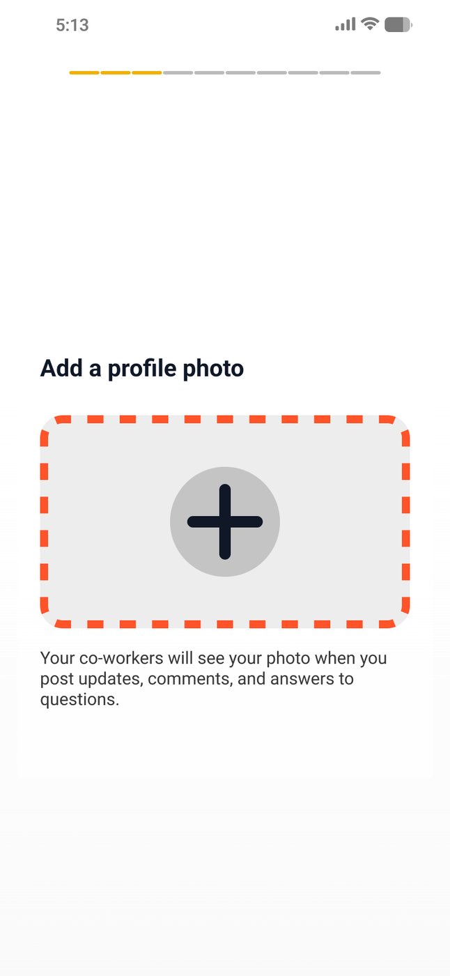
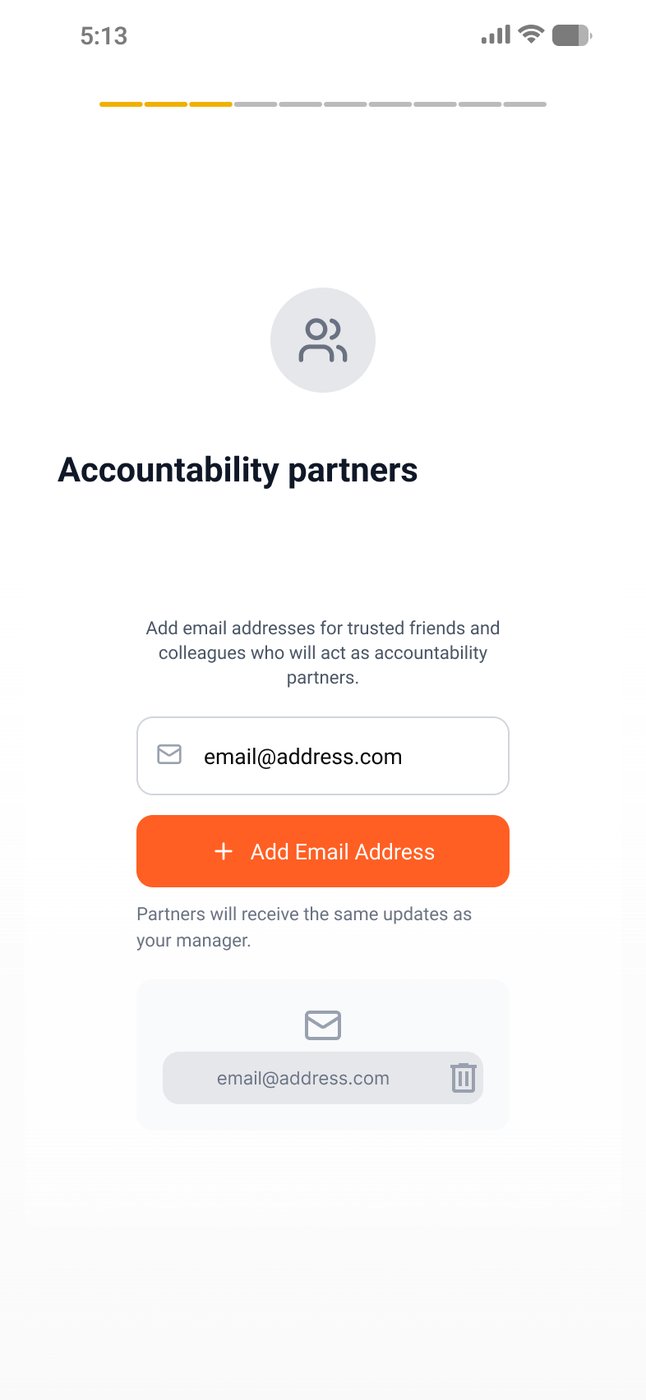
The last files are dev handoff files: annotated, versioned and specced right down to the delay on a finalize button. New pieces like accountability partners went in at the same level of detail.

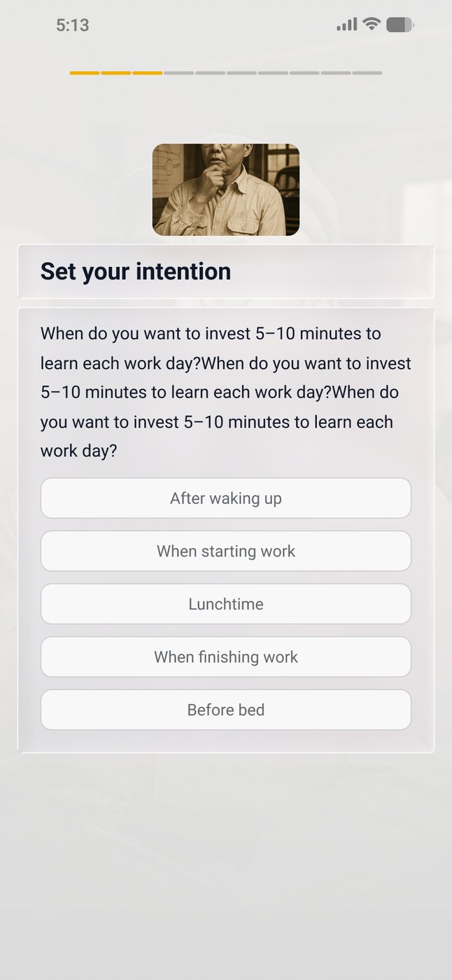
Set your intentionSet your intention
Add a profile photoAdd a profile photo
Accountability partnersAccountability partners
Fig. 32Final · Ready for devFrom the final handoff file: setting a daily learning time, a profile photo for the community, and accountability partners.
What it added up to

A product someone else can keep building

Three years is long enough that the deliverable stops being screens. By the end there was a component library behind mobile, web, light and dark; a reward system designed as six families instead of 38 one-offs (finished, though it never shipped); a streak model with every day state drawn; and a builder that let 1st90 put together a learner's path without a designer in the room.

The last thing in the archive is a stack of dev handoff files with everything written down. That's the right way for an engagement like this to end.

1st90 was my first paid product design work. Looking back, I'd do a lot of it differently. I'm still thankful for what we built, and for everything it taught me.

Thanks to Mike Heslin for the direction and the patience across all three years, and to the 1st90 team who built it.