Business Portal
Case study by I. Lototskyy · B2B SaaS portal
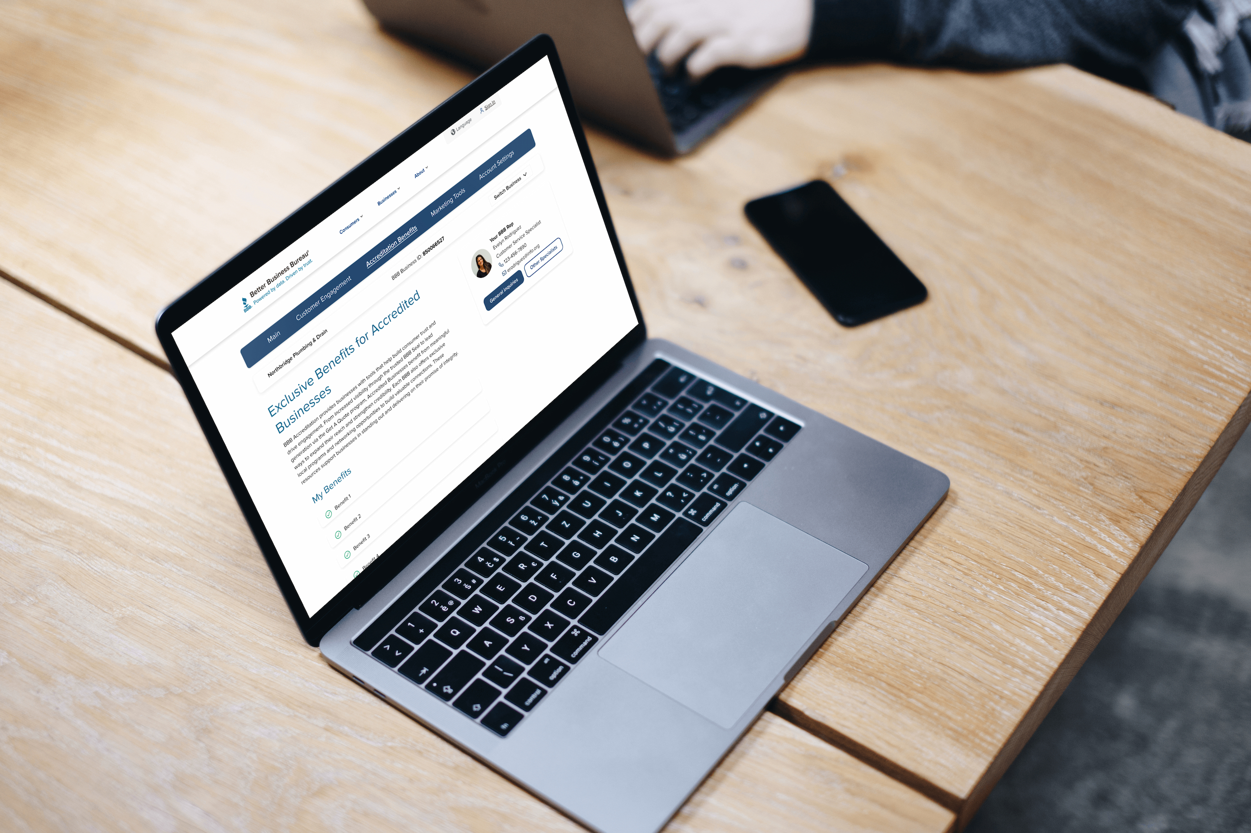
The Business Portal Redesign project aimed to improve clarity, workflow efficiency, and business confidence for millions of businesses using the BBB Business Portal, by modernizing its user interface and streamlining self-service experiences.
Business Portal Redesign
This project focused on improving clarity, workflow efficiency, and business confidence within the BBB Business Portal.
Role: UX/UI Designer
Status: Approved design, development in progress
Timeline: July – October, 2023
Deliverables: Research synthesis, UI redesign, high-fidelity prototypes, usability validation
Goal: Deliver a streamlined self-service experience that helps businesses understand their performance and take meaningful action to improve trust.
Project Overview
The BBB Business Portal supports millions of businesses in managing their accreditation, profile visibility, billing, and customer interactions. The legacy version used outdated interface patterns with unclear hierarchy, resulting in unnecessary customer support volume and low adoption of digital tools.
Our modernization initiative focuses on three essential experience pillars: clarity, actionability, and trust.
Problem Statement
Research identified four primary UX issues:
Confusing navigation and terminology: Users struggle to locate core actions such as paying dues or editing profiles
Insights lacked meaning and context: “I see numbers, but I do not know whether they are good or bad.”
Design did not reflect credibility or modern expectations: Perceived as outdated and less trustworthy
Difficult to scale: Hard to introduce enhancements like new tools or data insights
I know BBB has tools for my business, but I do not know where to find them.
Users & Research
Target users included:
Small business owners
Multi-location business managers
Accreditation and customer success representatives
Methods used:
SME interviews with local BBB offices
Heuristic evaluation of the current portal
Analytics review for top tasks and most-clicked features
User feedback collected through support conversations
Key UX insights:
Users prioritize billing and profile updates above all other tasks.
Metrics must convey meaning and prompt the appropriate action.
Guidance should increase self-service completion.
The mobile experience needs significant improvement for on-the-go business owners.
I want to know what to fix first instead of guessing.
Design Goals
Reduce time to complete top tasks by 25 percent.
Provide clear visual hierarchy and KPI interpretation.
Enable multi-business switching within a single account.
Create a mobile-first, scalable design aligned with the BBB design system.
Strategy & Approach
This redesign focused on:
Restructuring information architecture around user priorities
Introducing modular cards for scalable delivery
Prioritizing status and urgent tasks
Elevating data insights to actionable value
Removing visual noise and redundant branding
This version feels like it is helping me run my business.
Before & After: Dashboard
Before
Decorative branding overshadowed function
Support contact was primary CTA
Navigation unclear
No visual hierarchy makes it hard for the user to scan the page and quickly find the tasks they want to complete.
After
Action-first layout with contextual insights
Quick access to invoicing and profile actions
Simplified KPI cards with clear labeling and trends
Direct category navigation in hero region
A more purposeful hierarchy improves findability and speeds task completion.
Before & After: Business Integrity Check
Before
Dense copy and fragmented warnings
Mixed affordances
Hard to scan
No clear severity hierarchy
After
Single prioritized list for critical issues
Standardized action buttons with clarity
Visually grouped categories with iconography
Levels marked as Critical / Warning / Good
Core Feature Enhancements
Feature: Task priority and severity ratings
User Value: Clear direction on what needs attention
Feature: Engagement metrics reformatted as KPI cards
User Value: Immediate comprehension of performance
Feature: “Take Action” workflow surfaced
User Value: Faster completion of high-stakes actions
Feature: Multi-business account switching
User Value: Easier management of multiple locations
Feature: Mobile-first responsive design
User Value: Reliable access anywhere
Validation & Feedback
Informal usability testing and stakeholder review demonstrated strong improvement:
+63 percent First-click success locating billing compared to legacy experience
Confidence rating navigating portal: Inconsistent (Legacy Experience) vs. Significantly improved (Redesigned)
Task completion friction: High (Legacy Experience) vs. Reduced cognitive load (Redesigned)
I know what needs attention right away.
Status & Next Steps
The redesign has:
Been approved by Product and Engineering
Entered phased development rollout
Delivered with full requirements and design documentation
Planned enhancements:
Guided onboarding for new accredited businesses
AI-powered recommendations for trust improvements
Benchmarking against similar businesses in the area
Reflection
What worked:
Early alignment with internal business experts accelerated clarity
Card-based modularity enables rollout in increments
Collaboration with engineering ensured feasibility from day one
What comes next:
Extend personalization based on business maturity
Continue research and A/B usability validation post-launch
Impactful design means reducing uncertainty and empowering confidence.
- Time to complete top tasks reduction
- 25 percent
- First-click success locating billing increase
- 63 percent